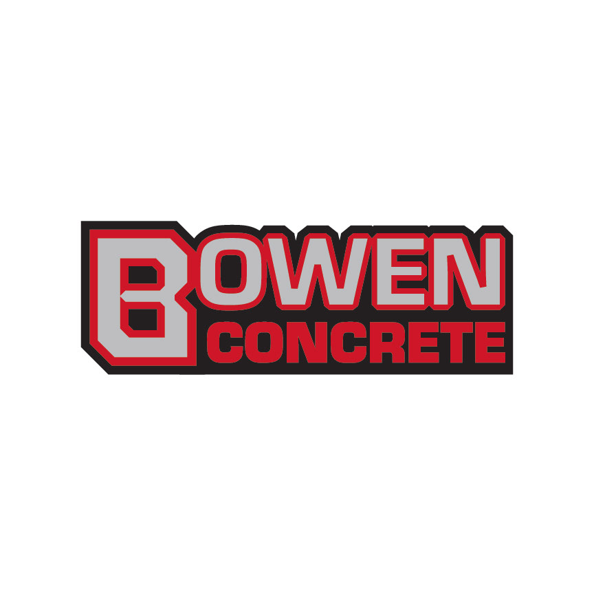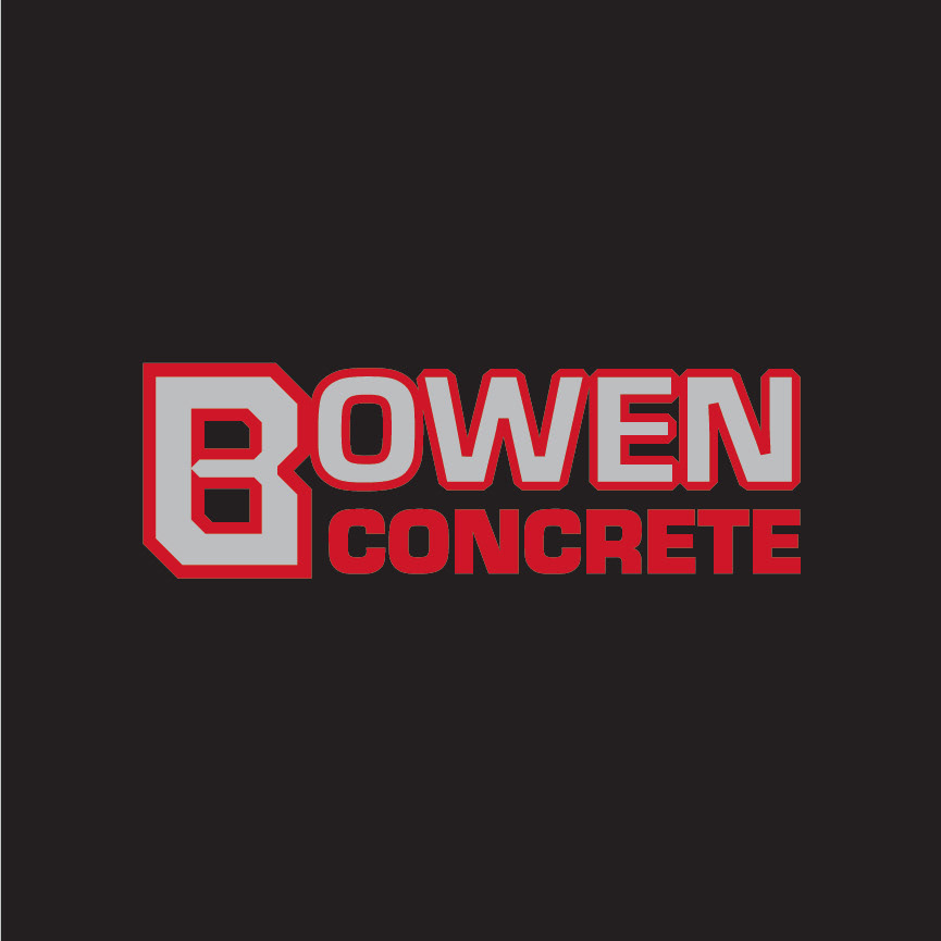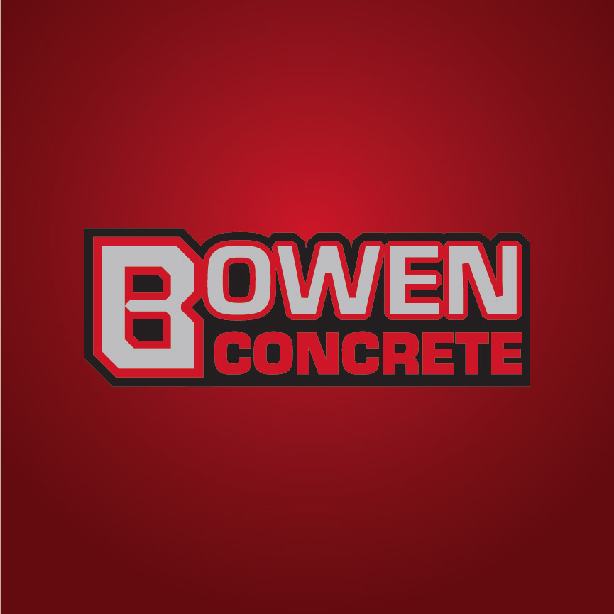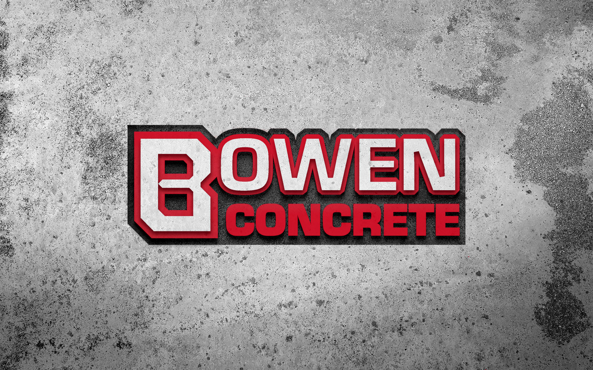
Bowen Concrete didn't have a logo for their concrete-based operations, and they wanted a strong, bold word mark that captured the essence of their work without and additional graphics that could be considered cliches of their industry (for example, no concrete trucks or spatulas allowed). They needed it to look good on their business cards, as well as on their company vehicles and other promotional swag, and incorporating a dark red was a must. With that in mind, I created a logo that feels like it could BE concrete, like it was formed and poured, with an iconic "B" that can stand alone if needs be, while looking good on any background.