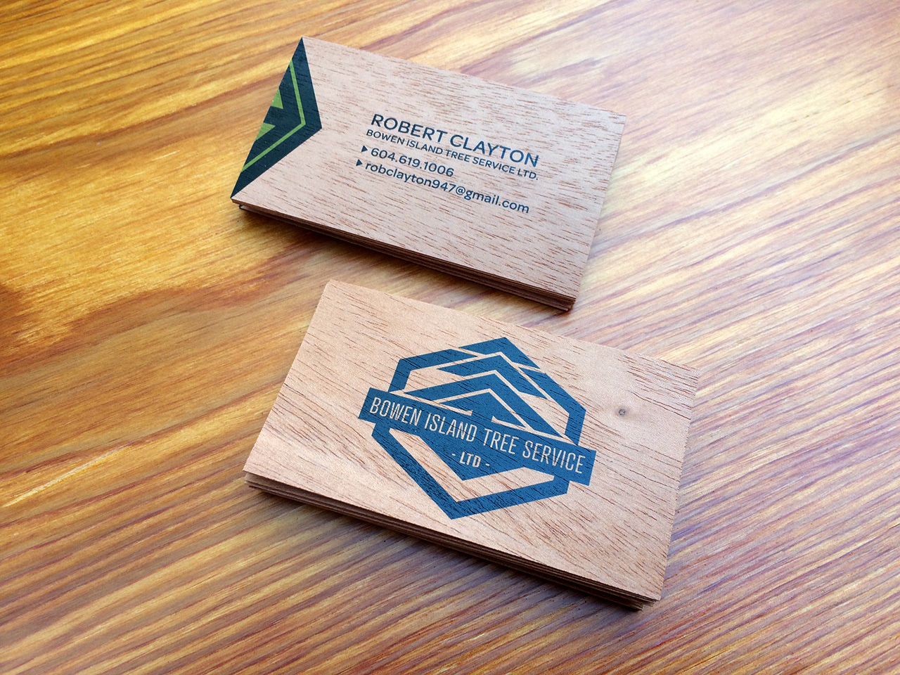
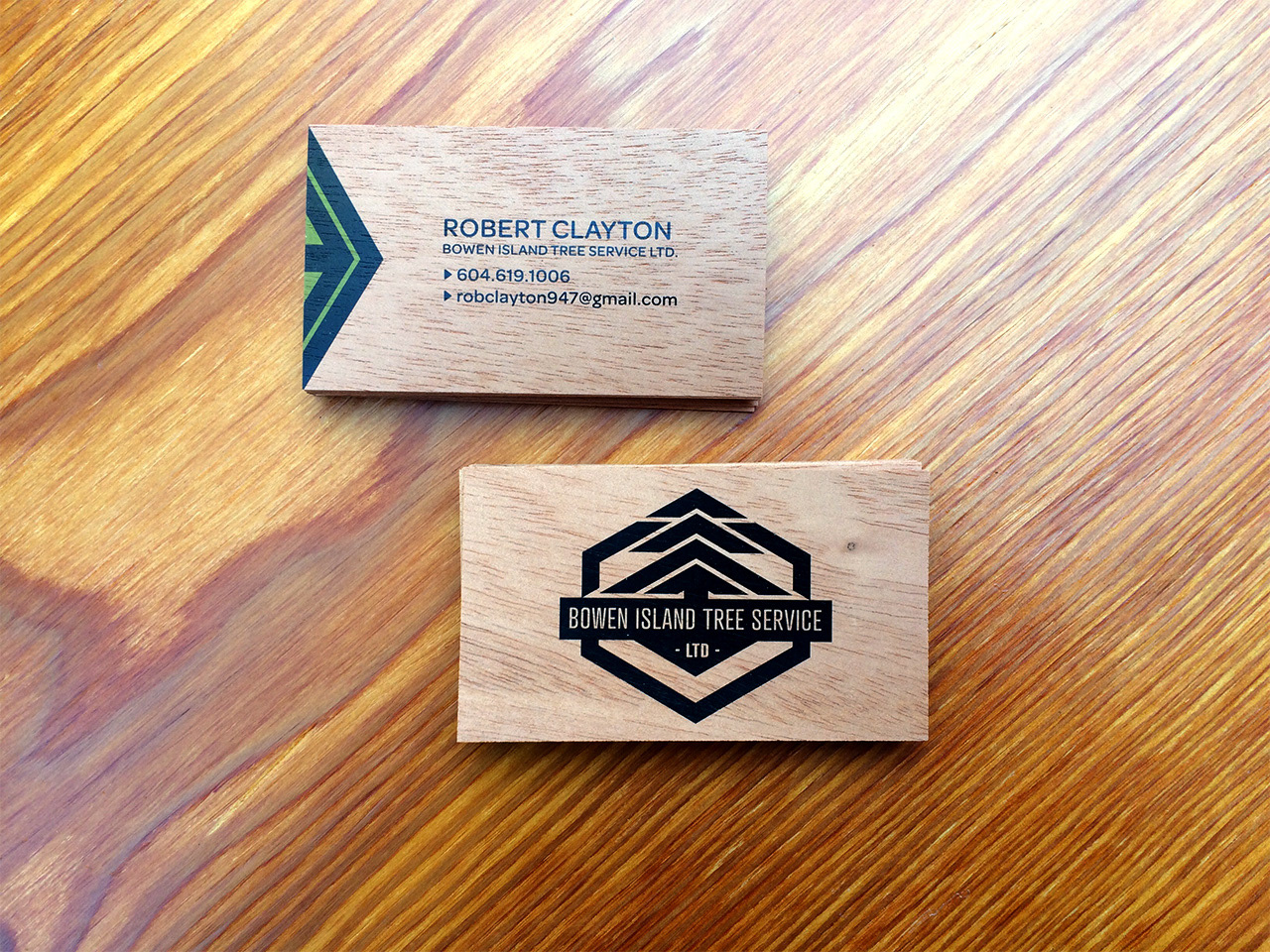
My client needed a logo for his tree service company, and at first all he knew was that he wanted trees incorporated and he liked the colour green. After some brainstorming we narrowed his aesthetic focus to include the desire for a simple yet bold design, have badge-like shape, and the flexibility to look good whether on a business card, black truck, or the side of his forest green John Deere equipment. What I came up with was a design incorporating strong geometric shapes and sharp negative space to frame that integral tree. I created a logo that holds together whether it is presented in 1, 2 or 3 colours.
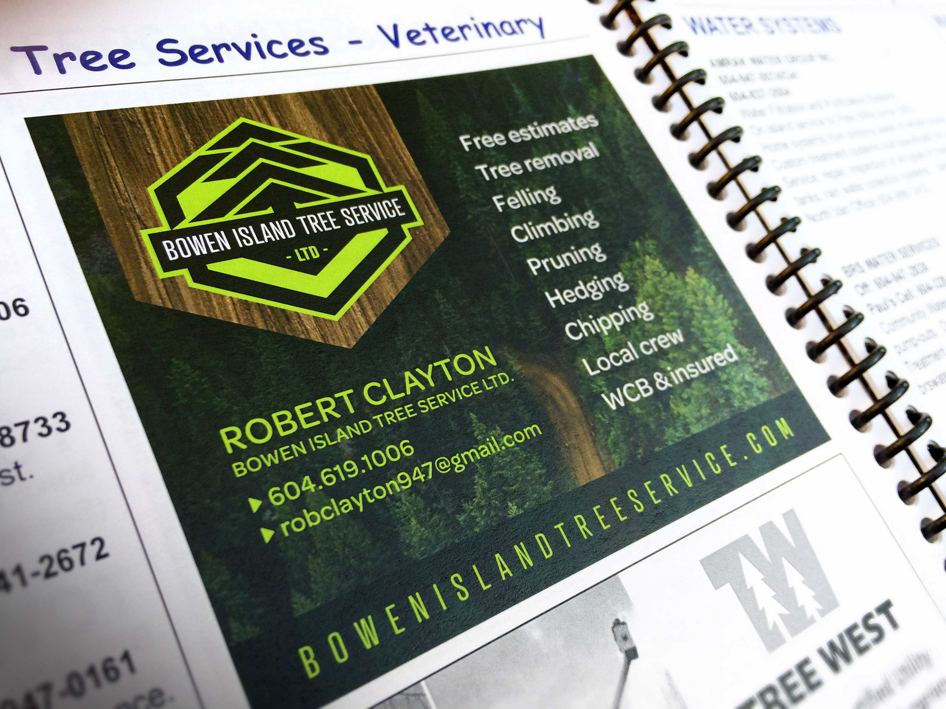
Once translated to a business card, I was able to use elements of the logo as accents. I chose cherry wood to print on in order to reinforce the wood-centric nature of my client's business in a very obvious visual and tactile way.

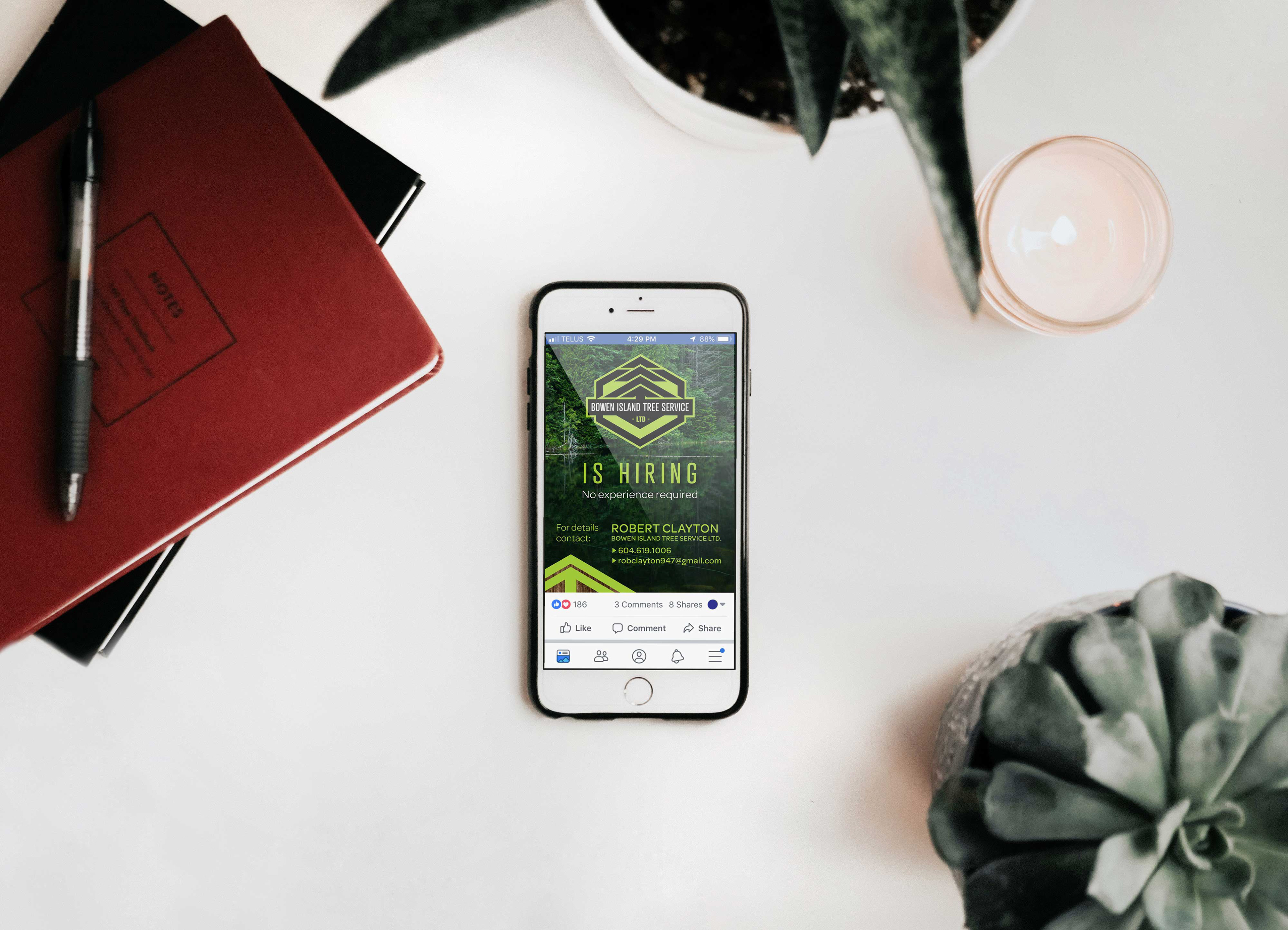
Advertising