fSquared Marketing is an award-winning consultancy and full-service marketing agency founded in 2012 with a dedicated focus on helping law firms achieve their strategic objectives, including everything from rebrands to strategic planning. As lead graphic designer for the fSquared team, I was tasked with bringing our new law-firm brands to life, as well as creating all fSquared's in-house graphics for self-promotion, including their latest website launched early 2018. I created designs for a variety of projects and numerous law firms, some of which ended up winning awards. The following is a selection of those projects grouped by client.
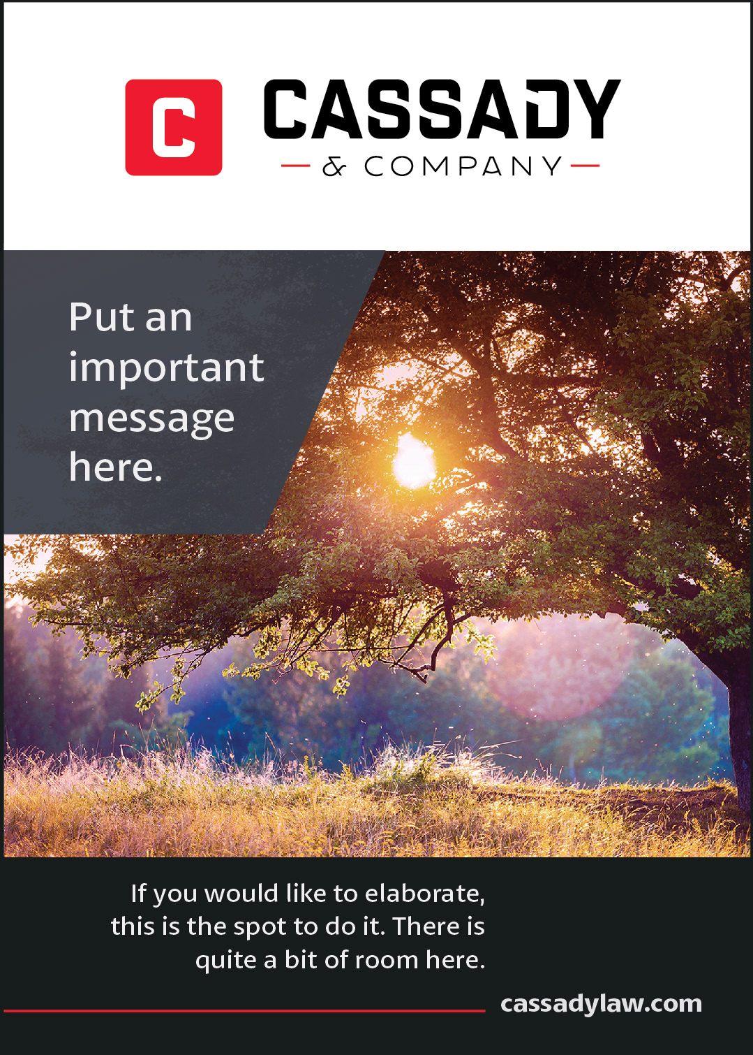
Cassady & Company

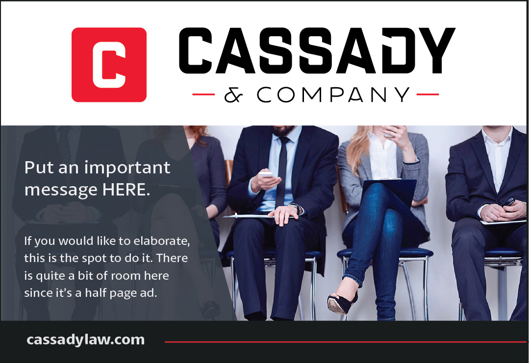
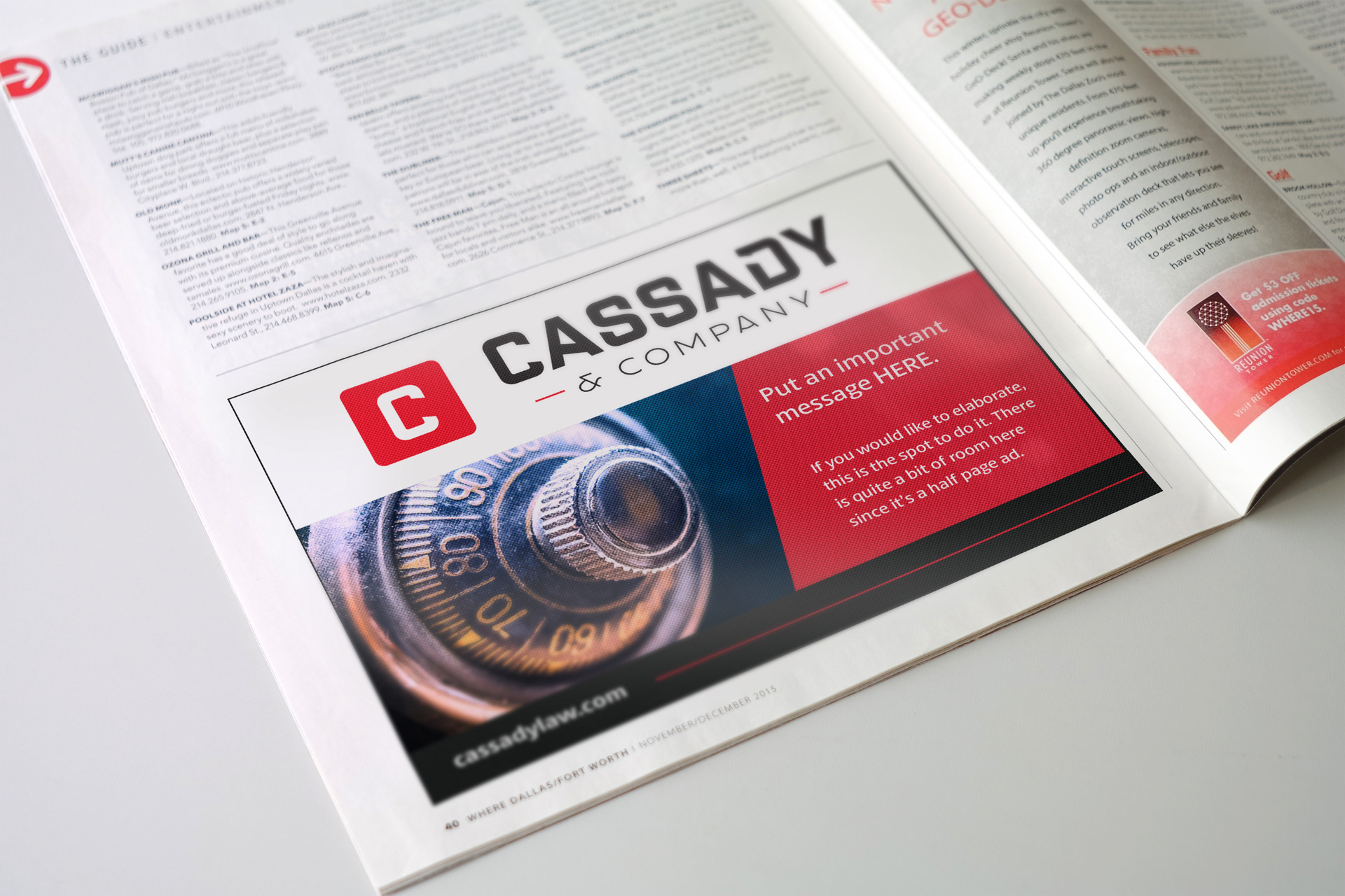
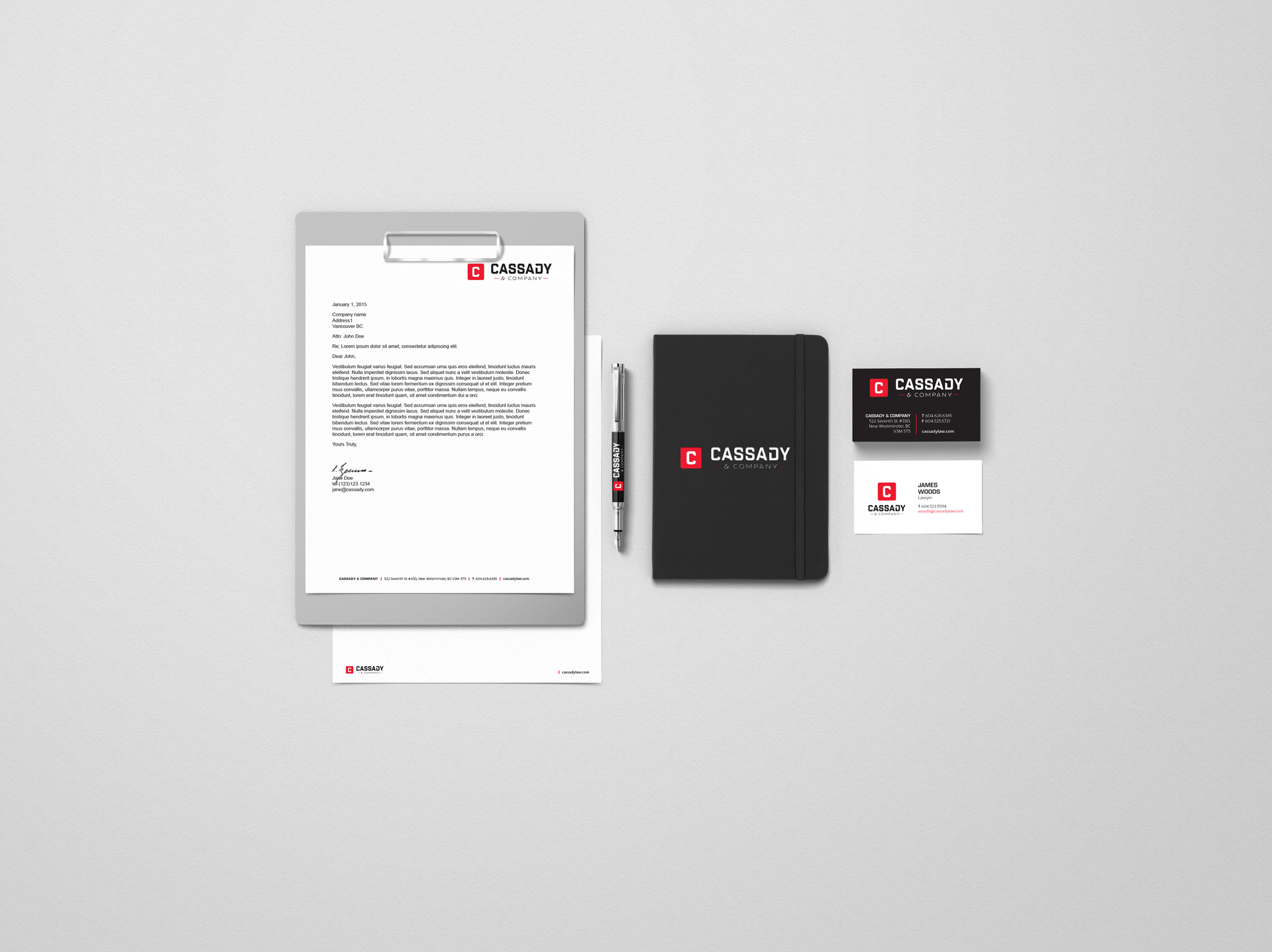
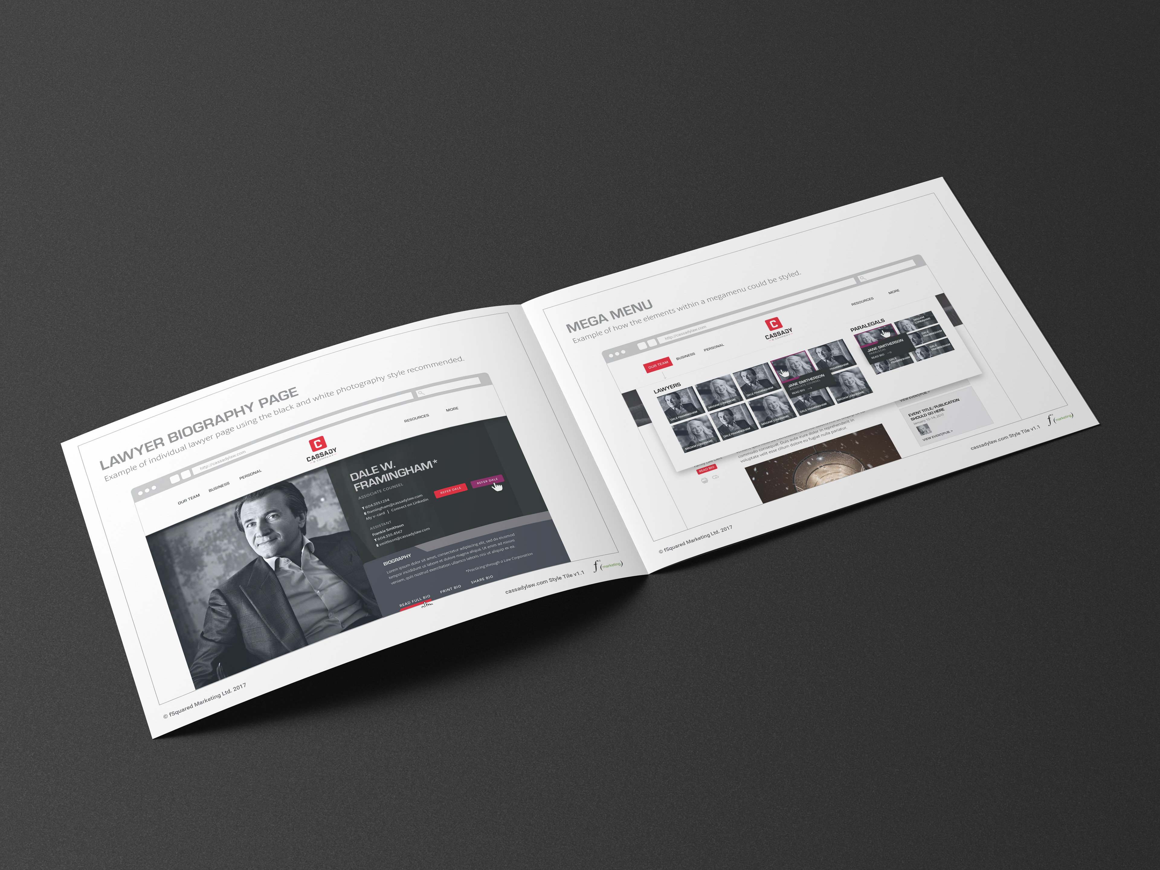
Cassady & Company, a law firm based out of New Westminster, provides both business and personal law services, and needed a new brand to reflect their range of services in a down-to earth manner. I was responsible for translating their new brand into an entirely new visual identity. Their logo was designed to be bold and flexible, with the stylized "C" standing on its own, or appearing atop or to the side of the word mark, depending on the context being used. I developed a brand style guide complete with fonts, colours and photography guidelines, business cards, digital letterhead and advertising templates.
I also designed their website, which won Gold for Web Design in the 2017 Marcom Awards.


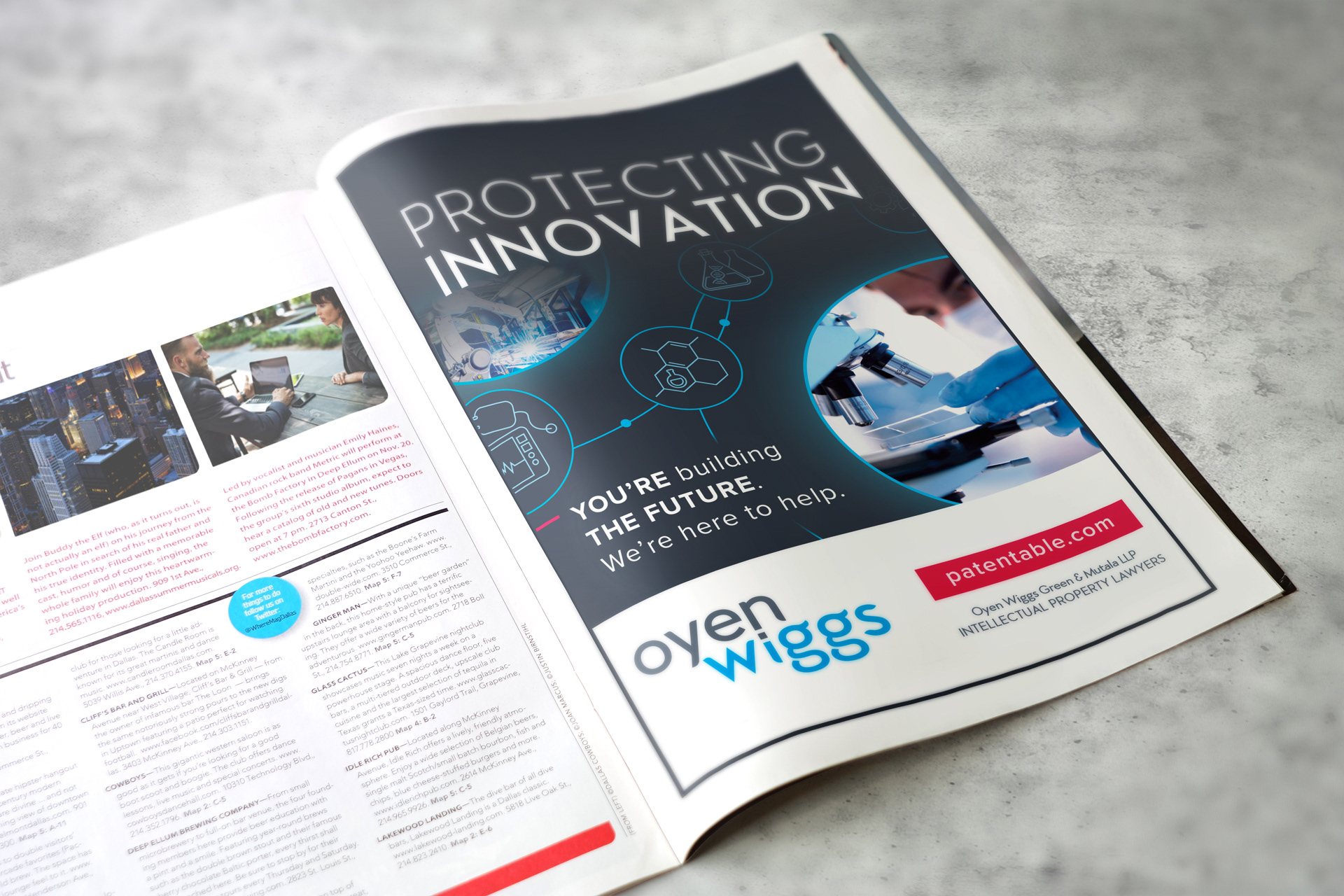
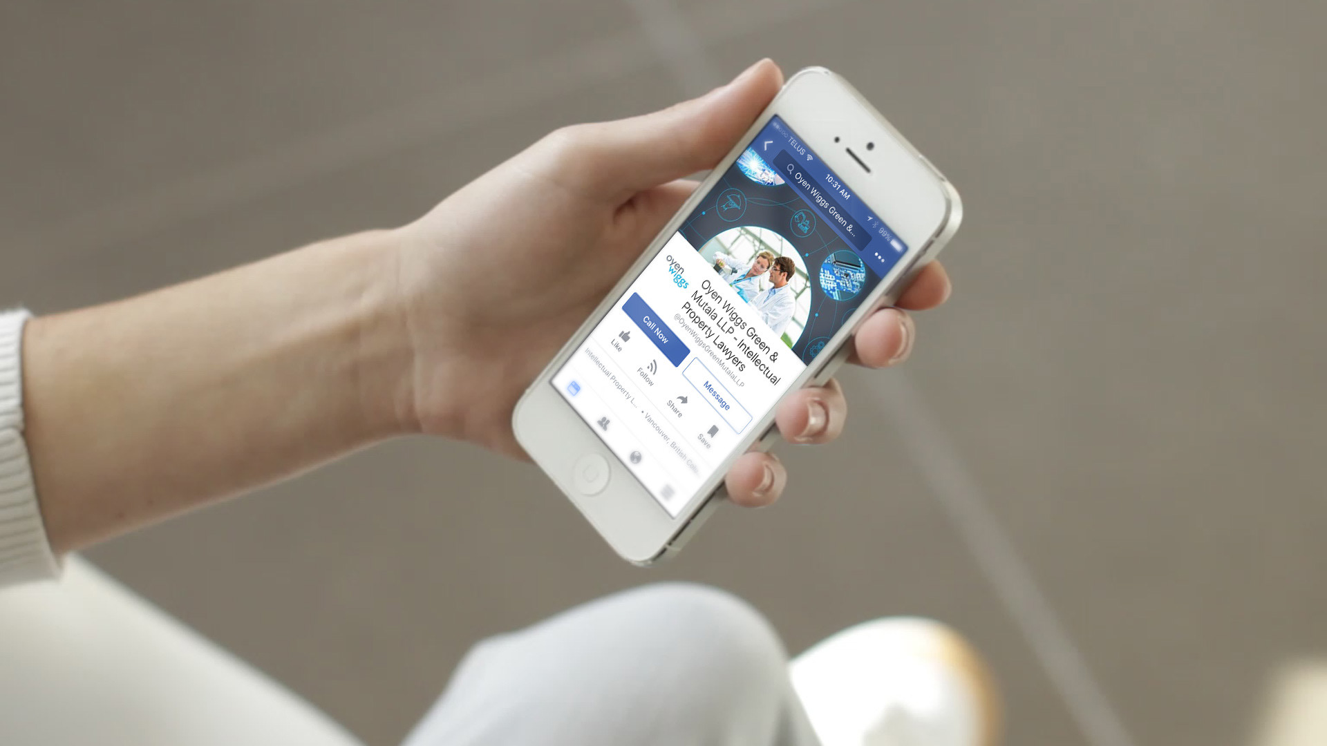
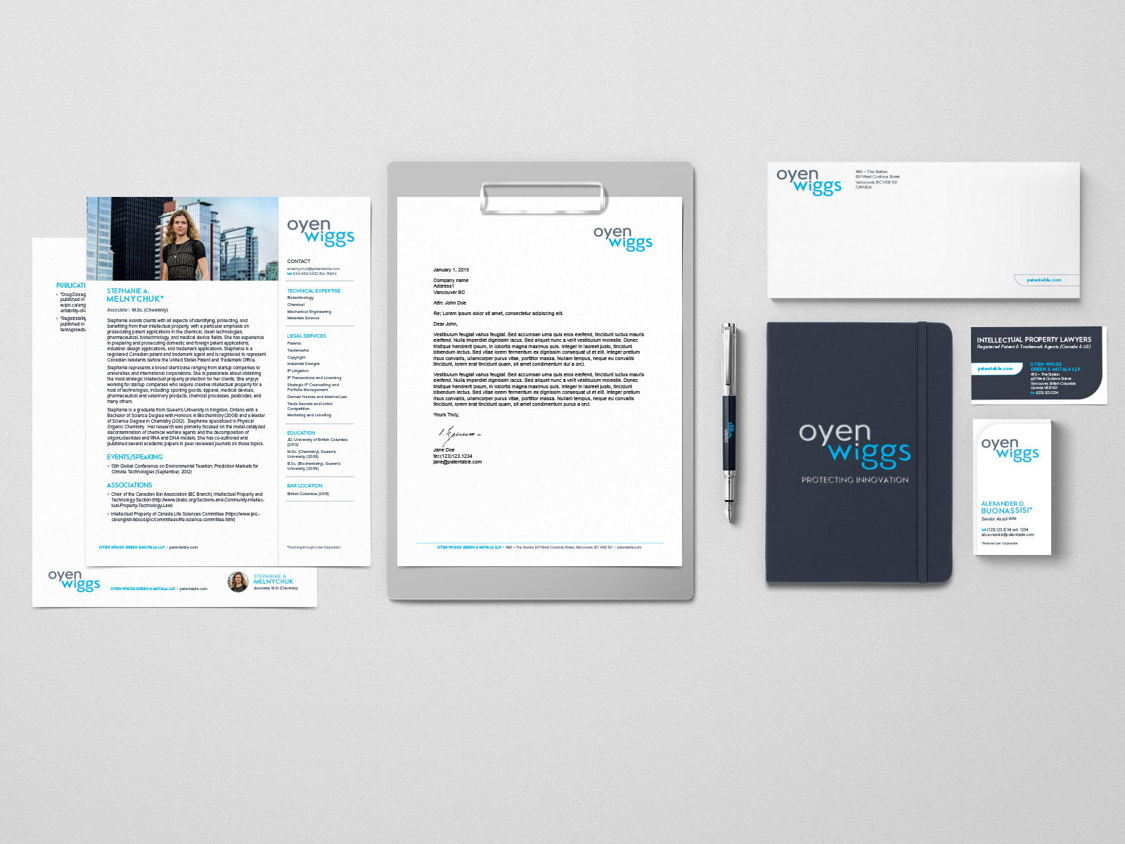
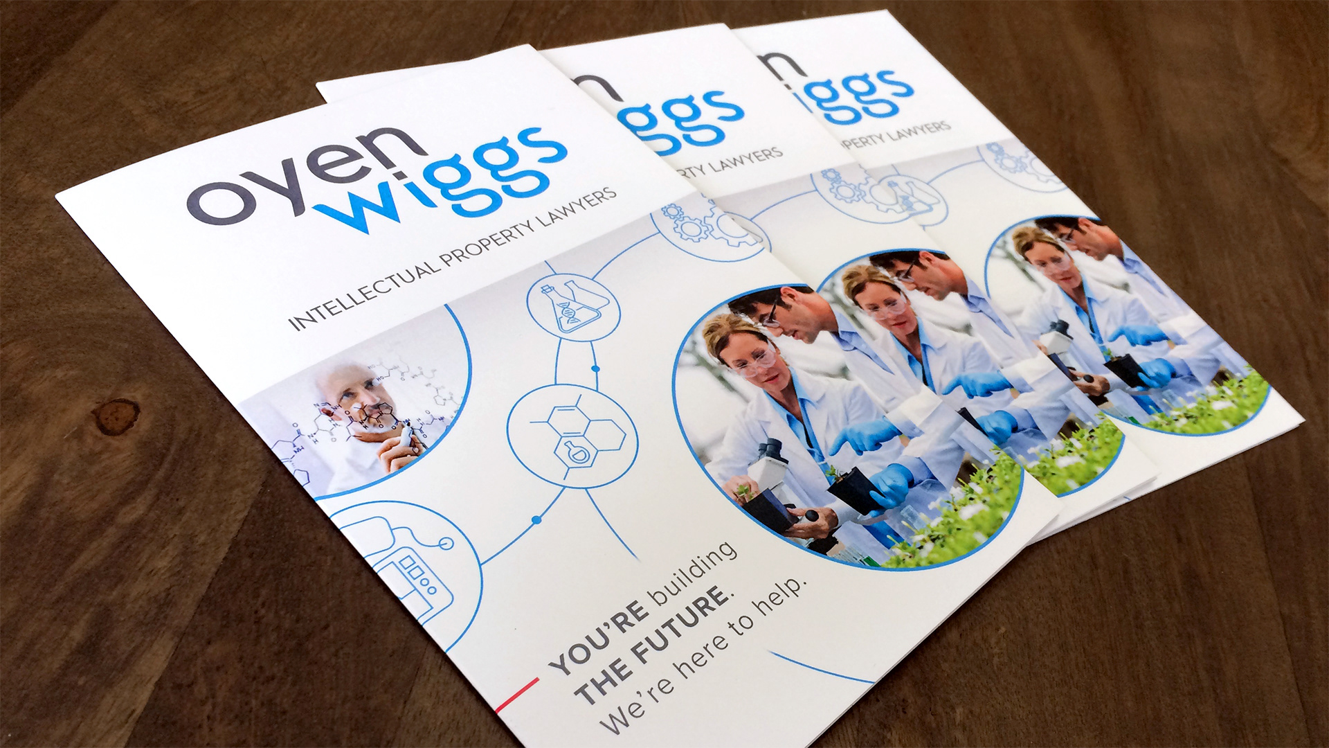
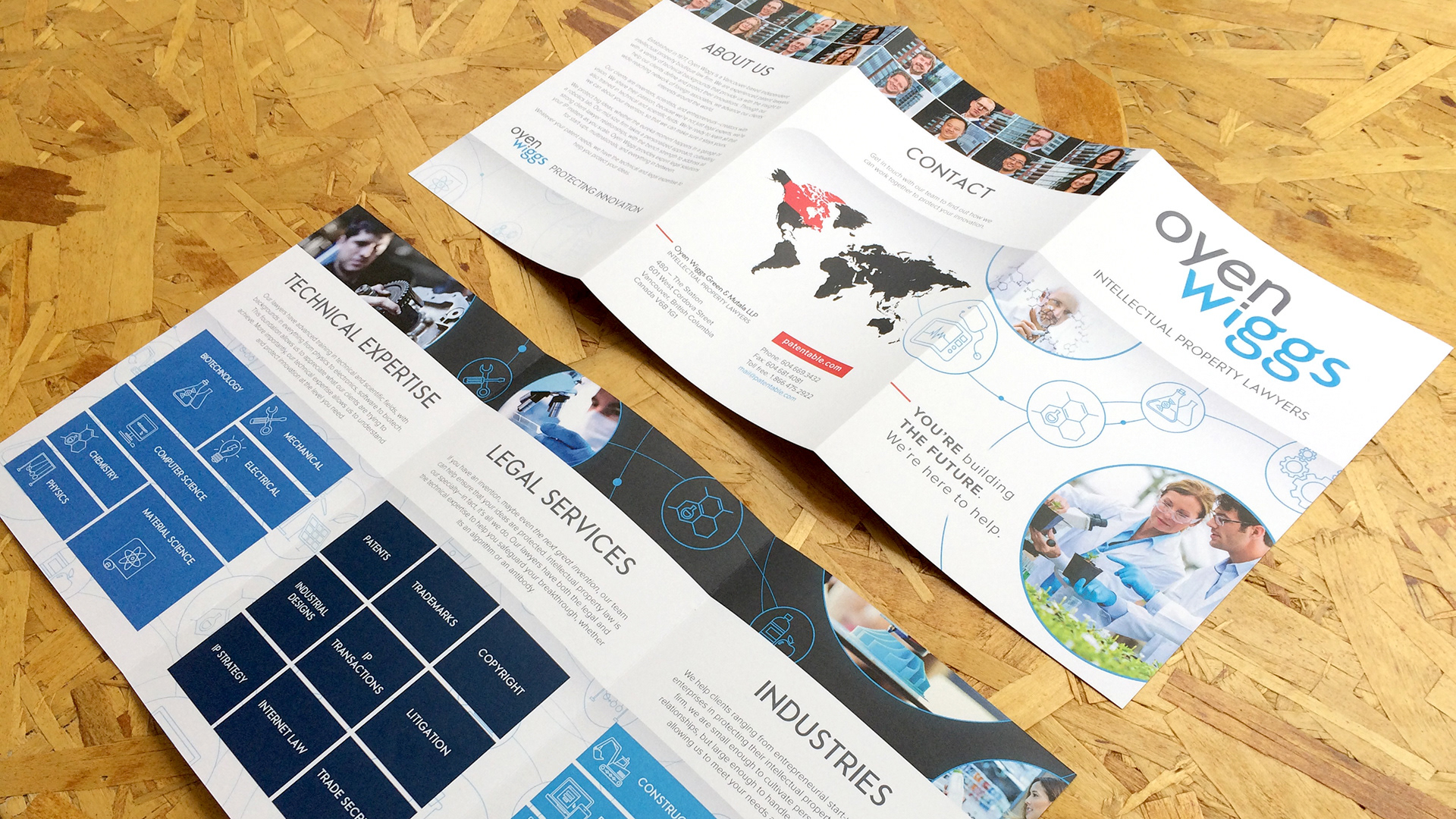
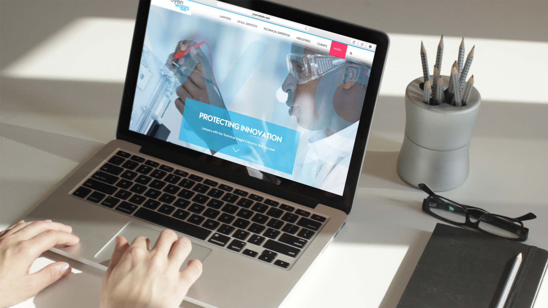
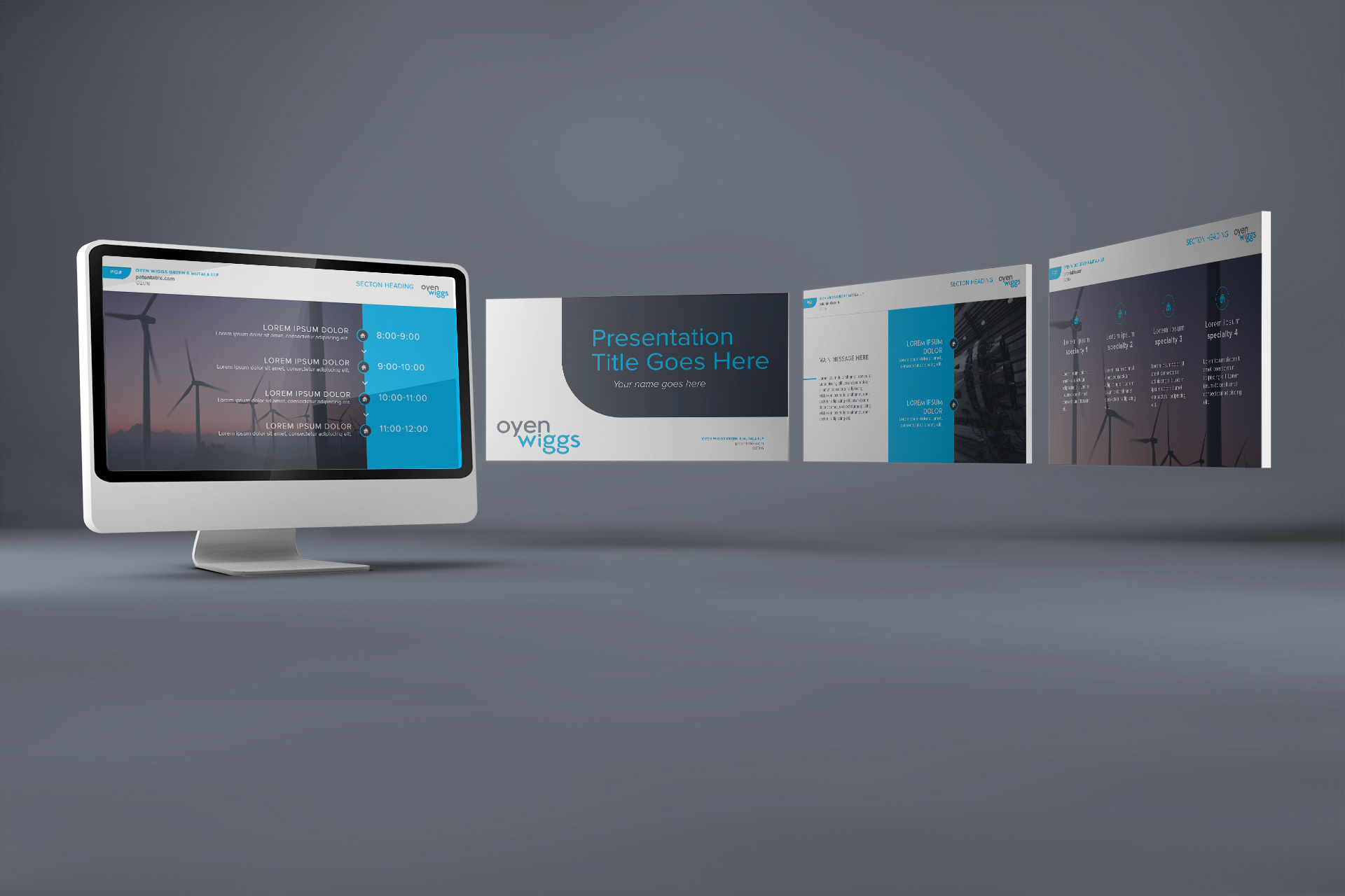
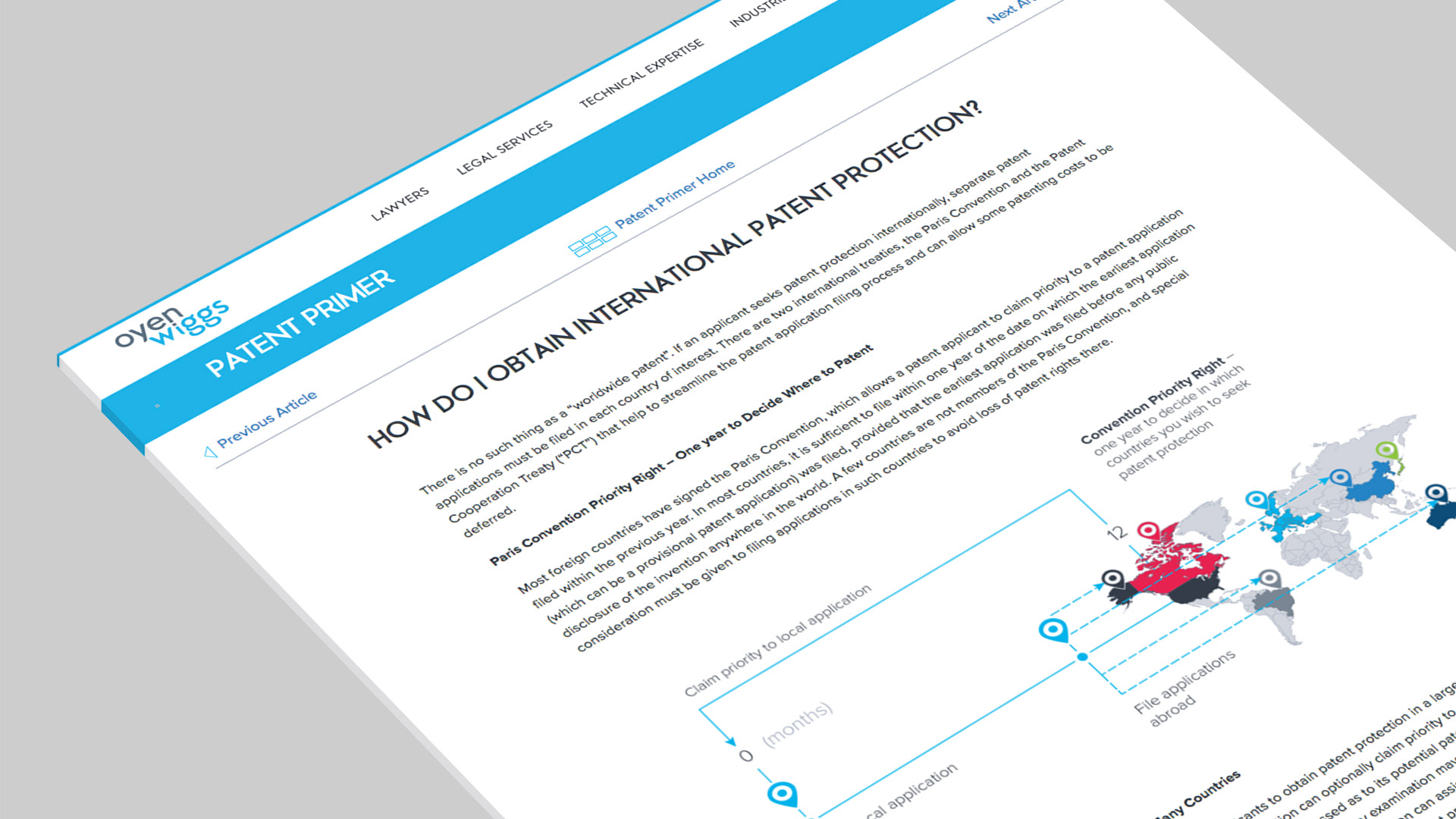
Oyen Wiggs
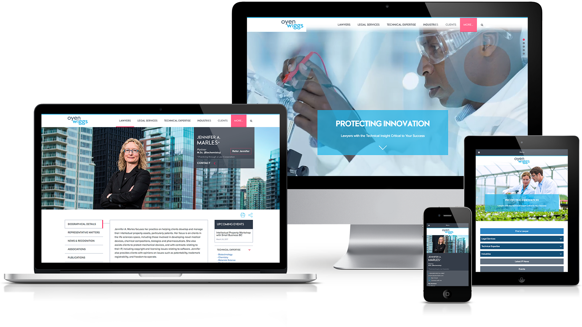
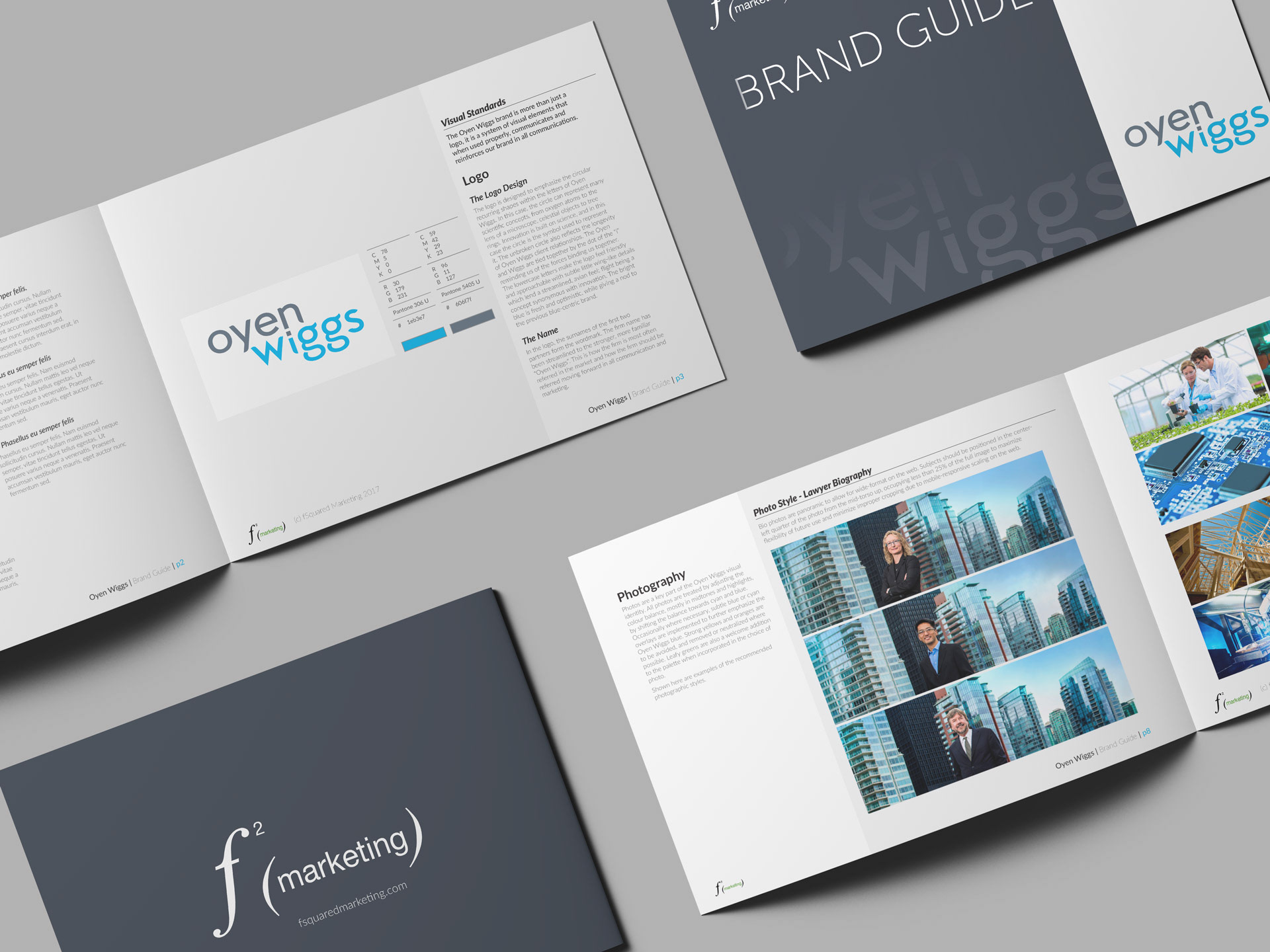
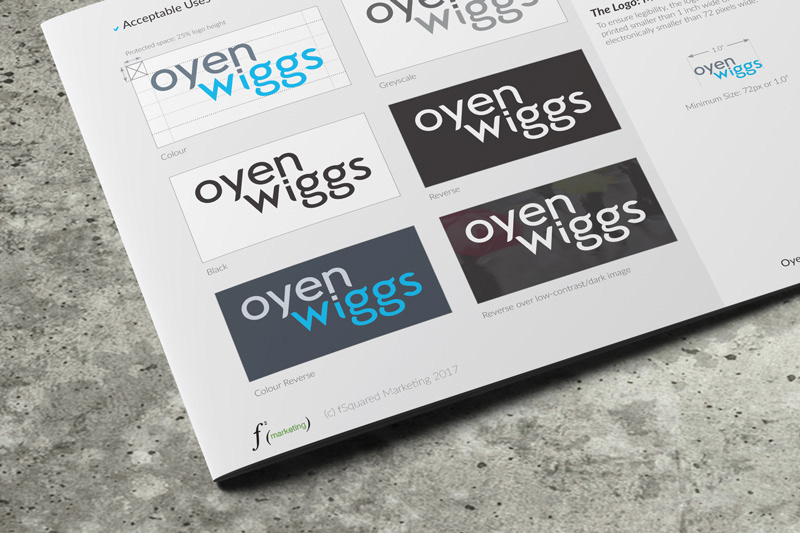
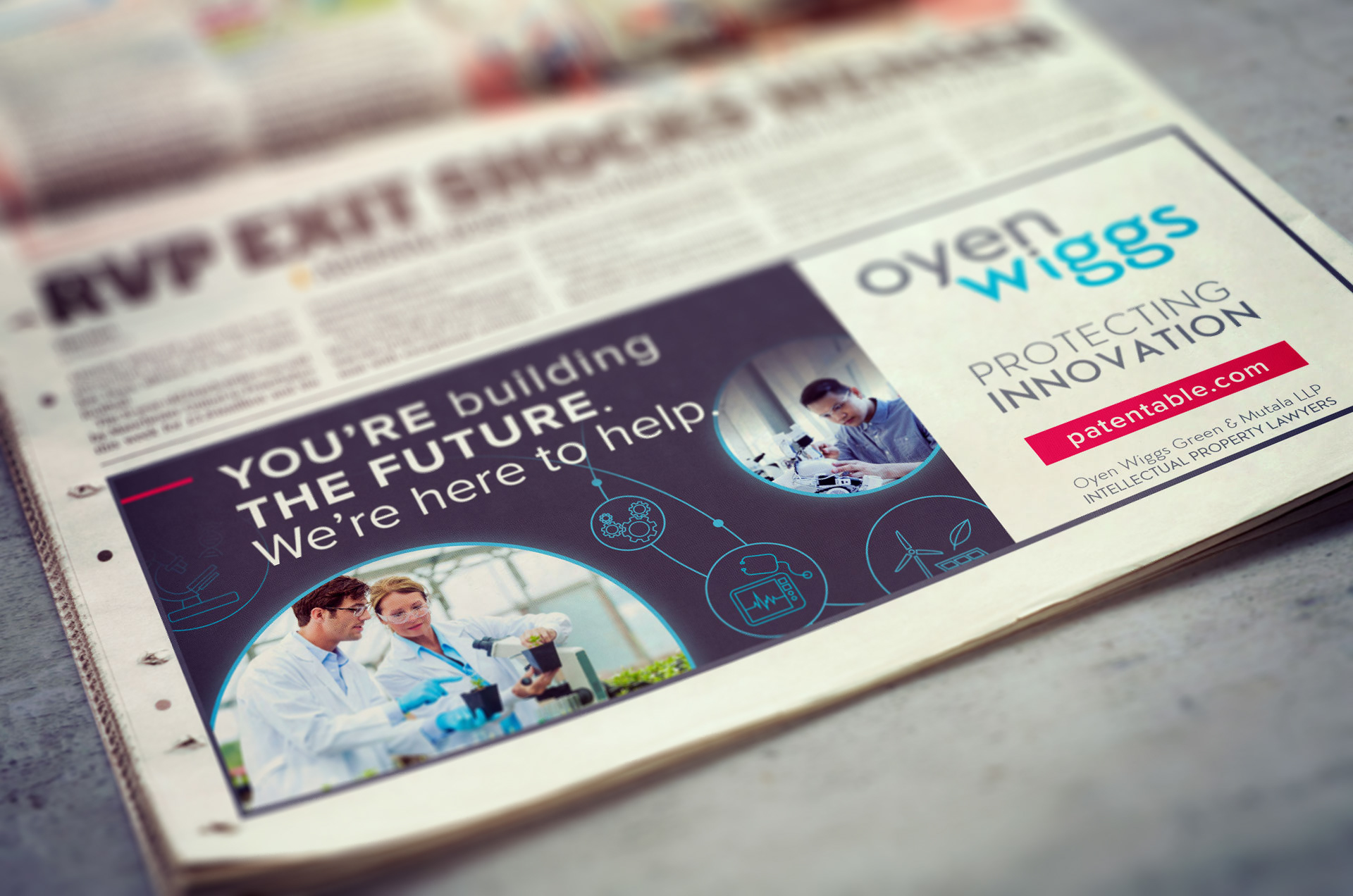
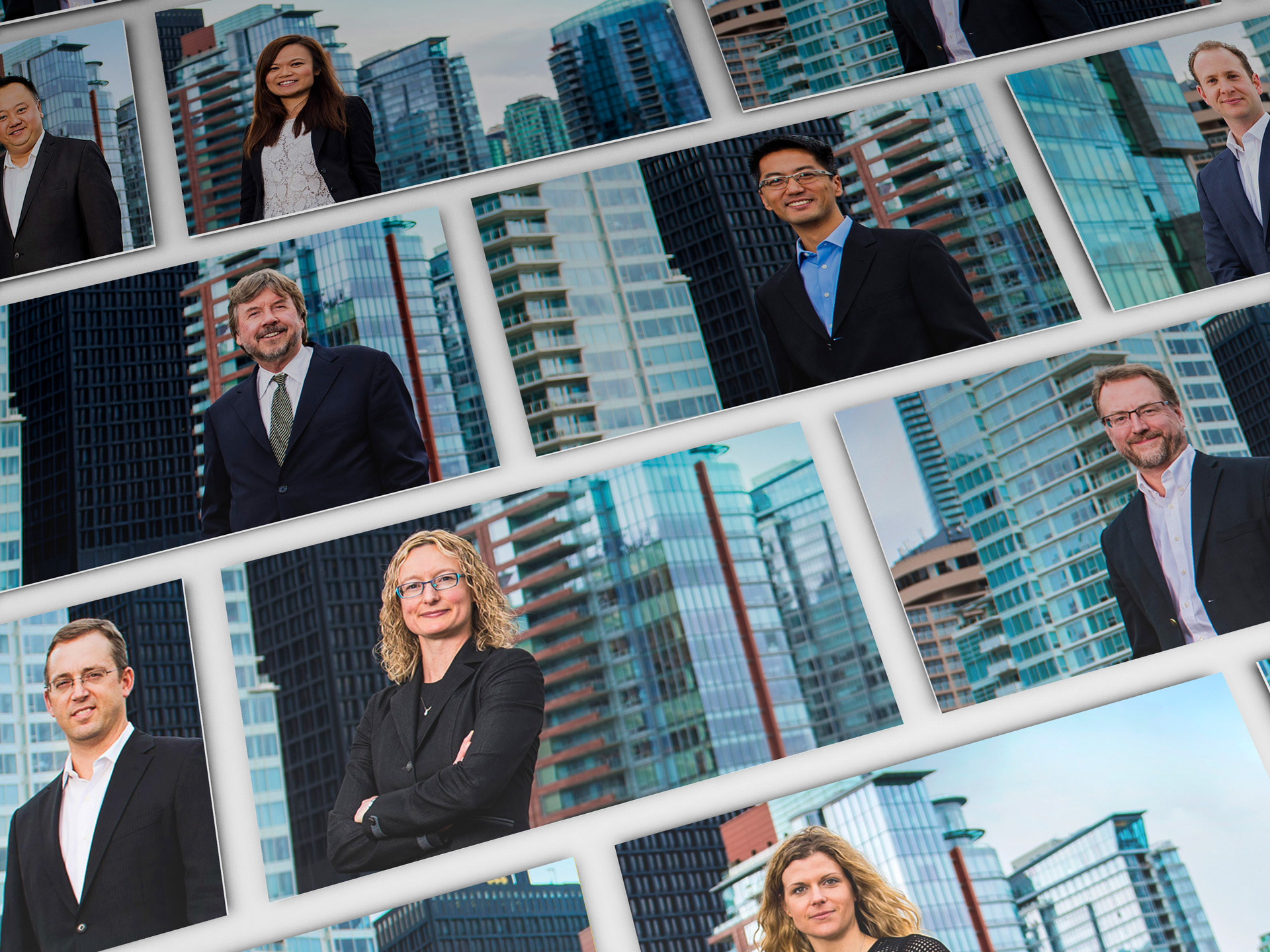
This was an in-depth rebrand project for a Vancouver law firm specializing in patent law. Oyen Wiggs is a world renowned law firm, but their brand did not reflect the breadth and depth of their expertise. fSquared Marketing completely rebranded them, and I fleshed-out the entire visual identity (fonts, colours, logo usage, photography guidelines etc). The brand elements I created included their new logo and brand style guide, business cards, envelopes, letterhead, print and digital ads, brochures, banners, trade show booth, powerpoint template and new website.
Oyen Wiggs branding received an honourable mention in the 2016 Marcom awards, and the website won Silver and Gold in the 2017 Davey and Hermes awards respectively. The website also recently won Best Website Design & Development at the 2018 Your Honour Awards.
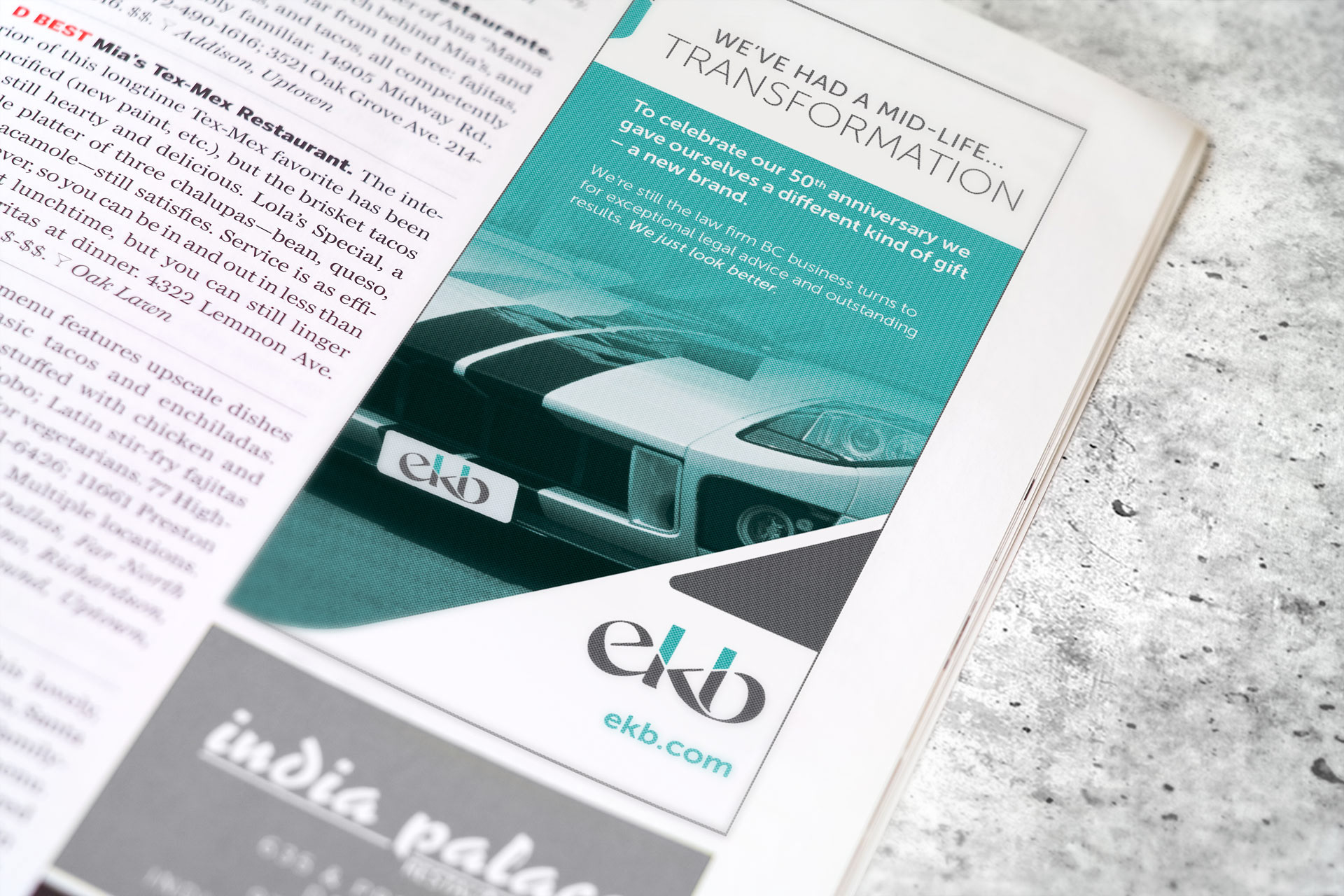
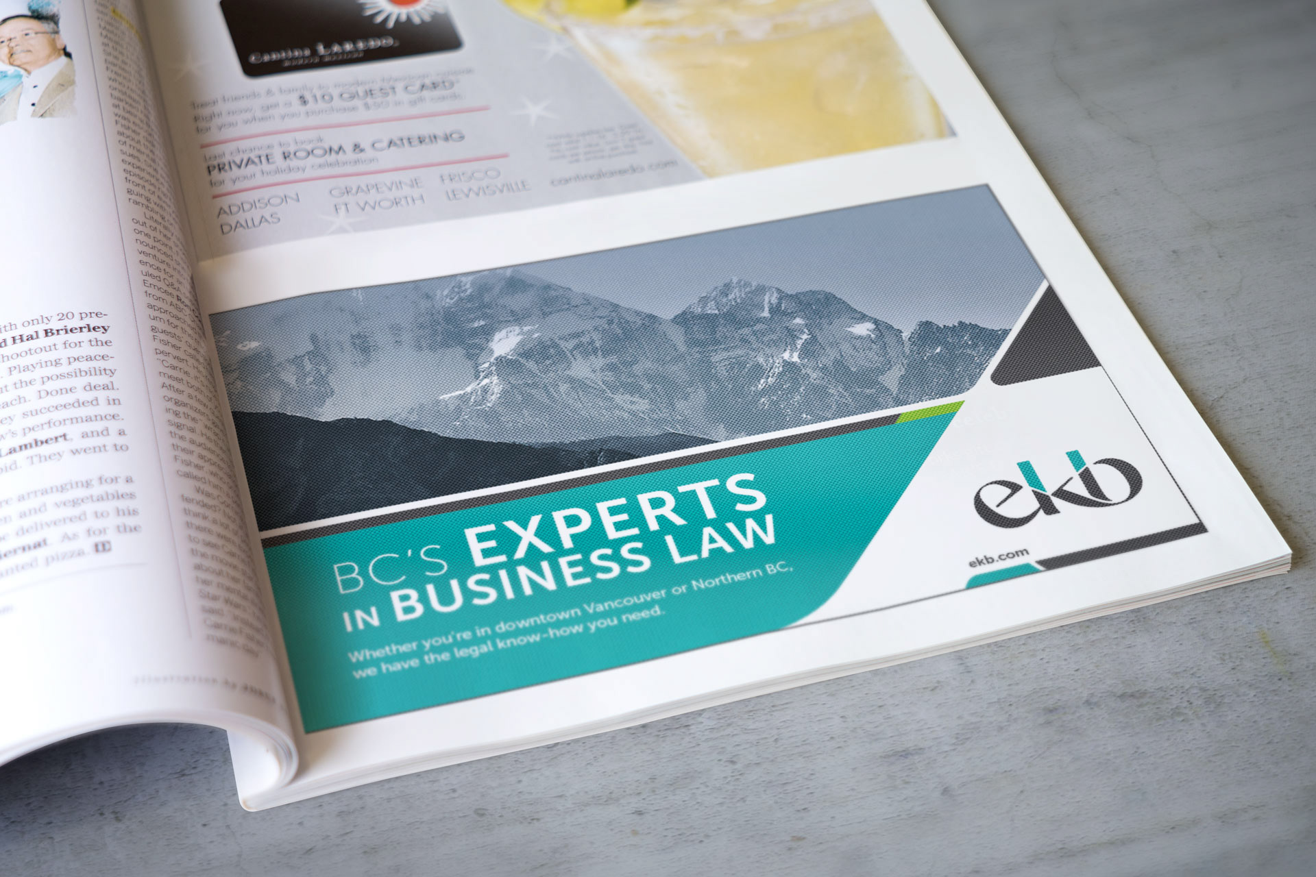
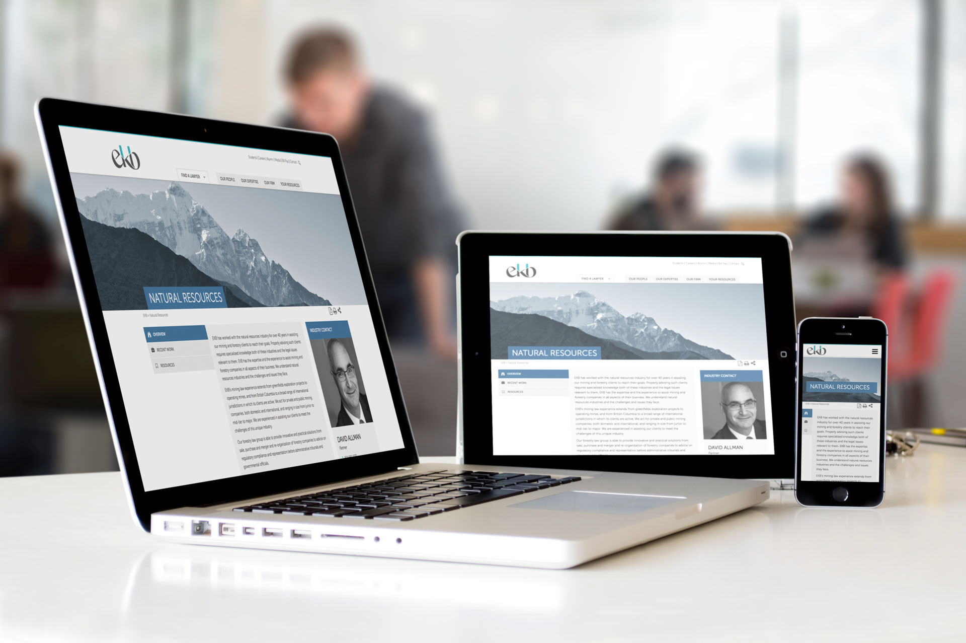
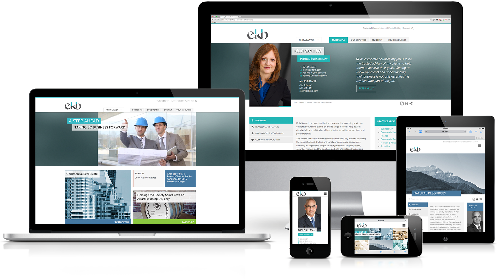
EKB
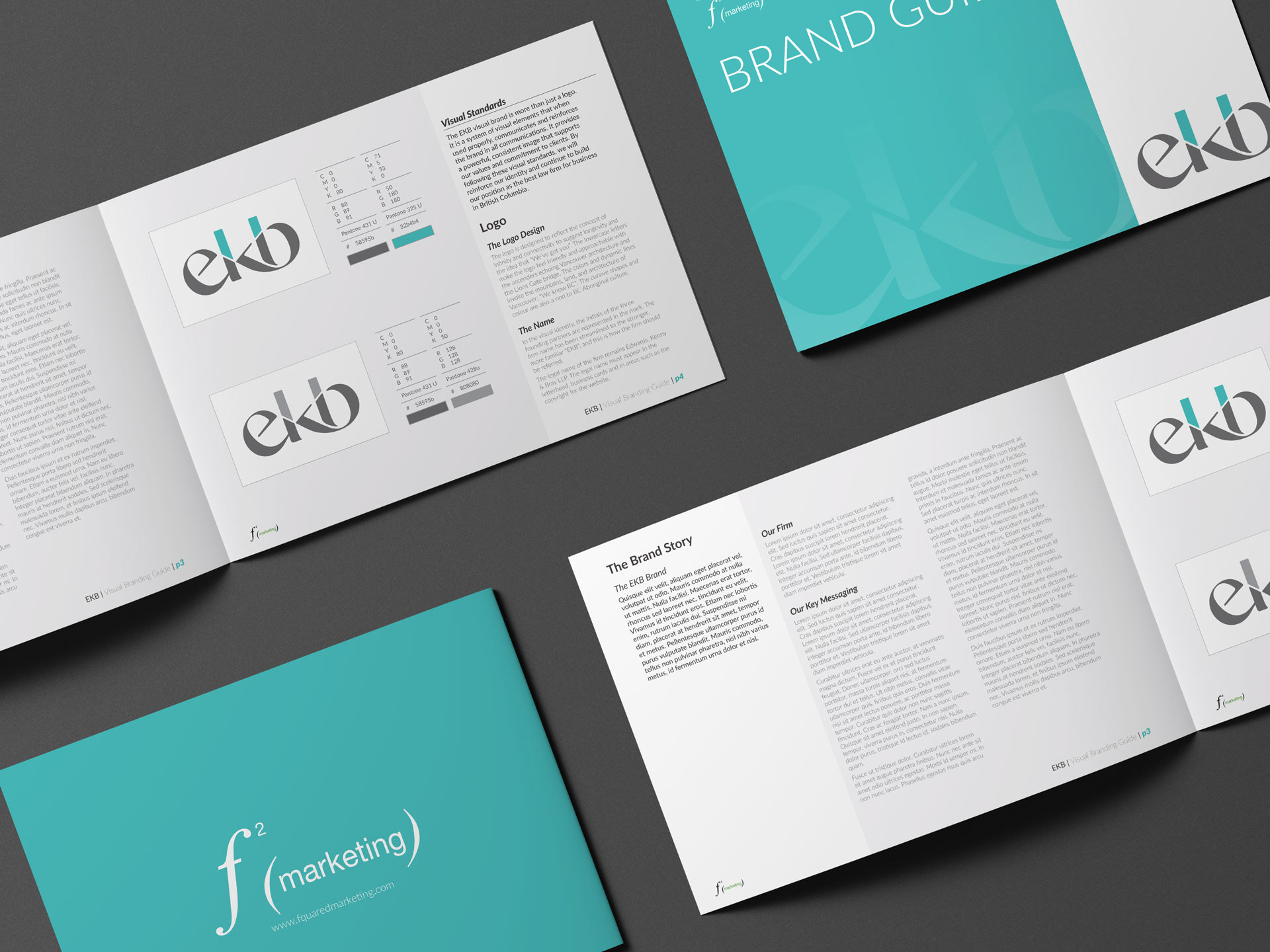
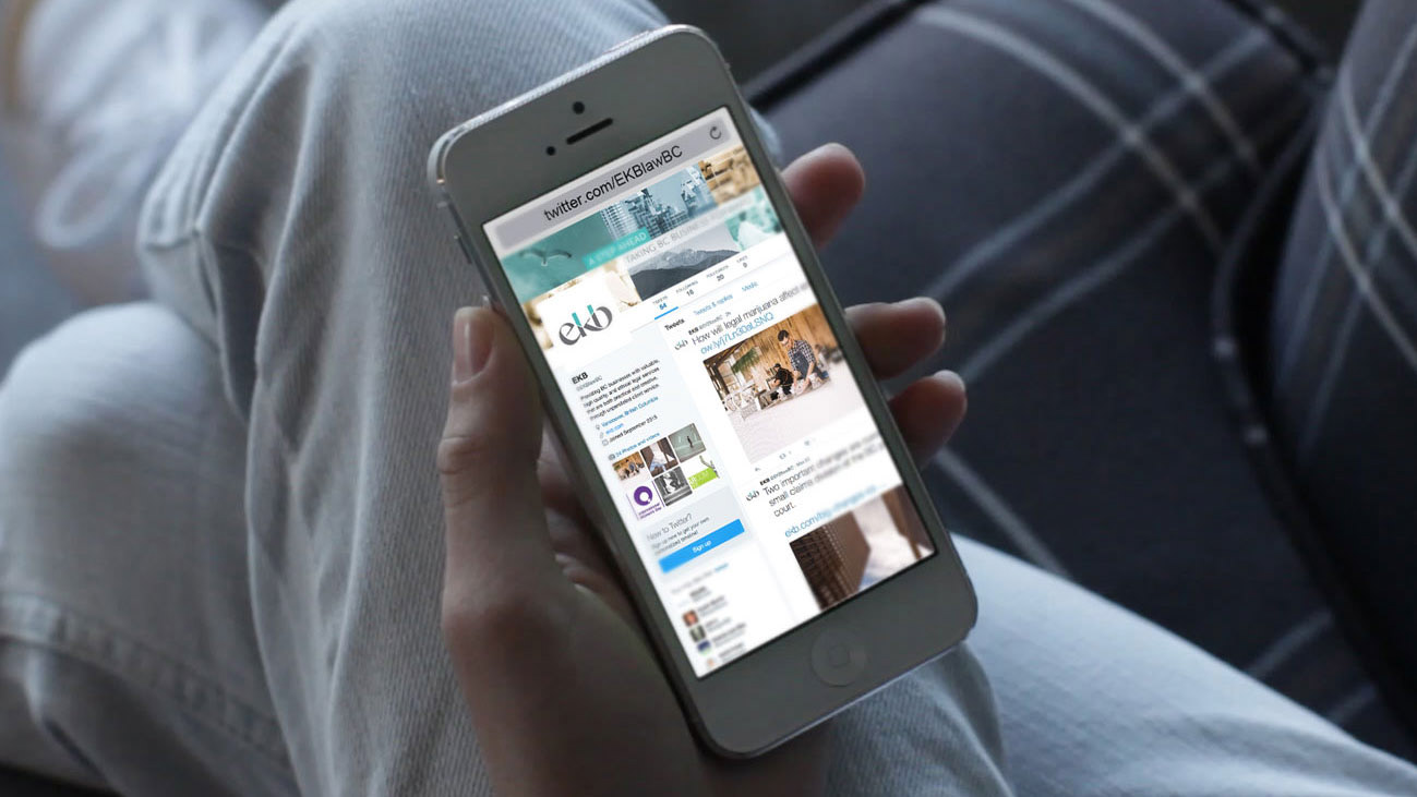
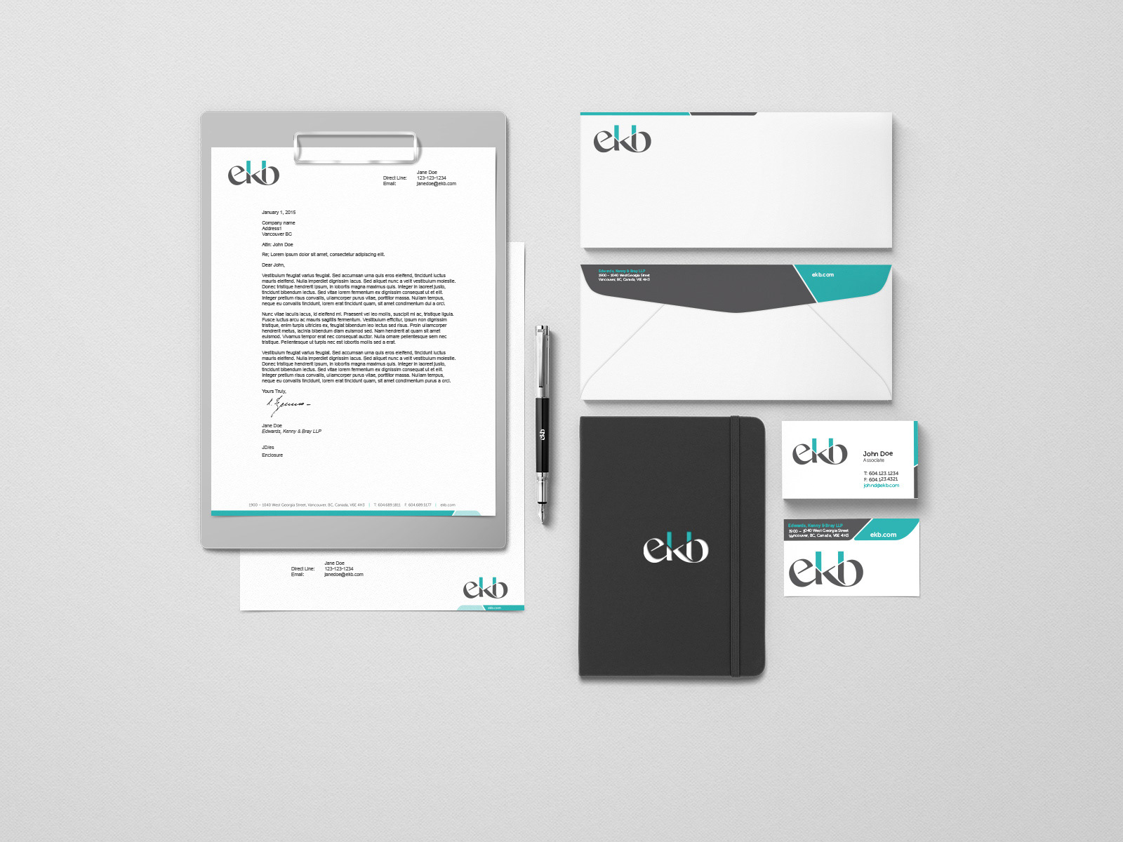
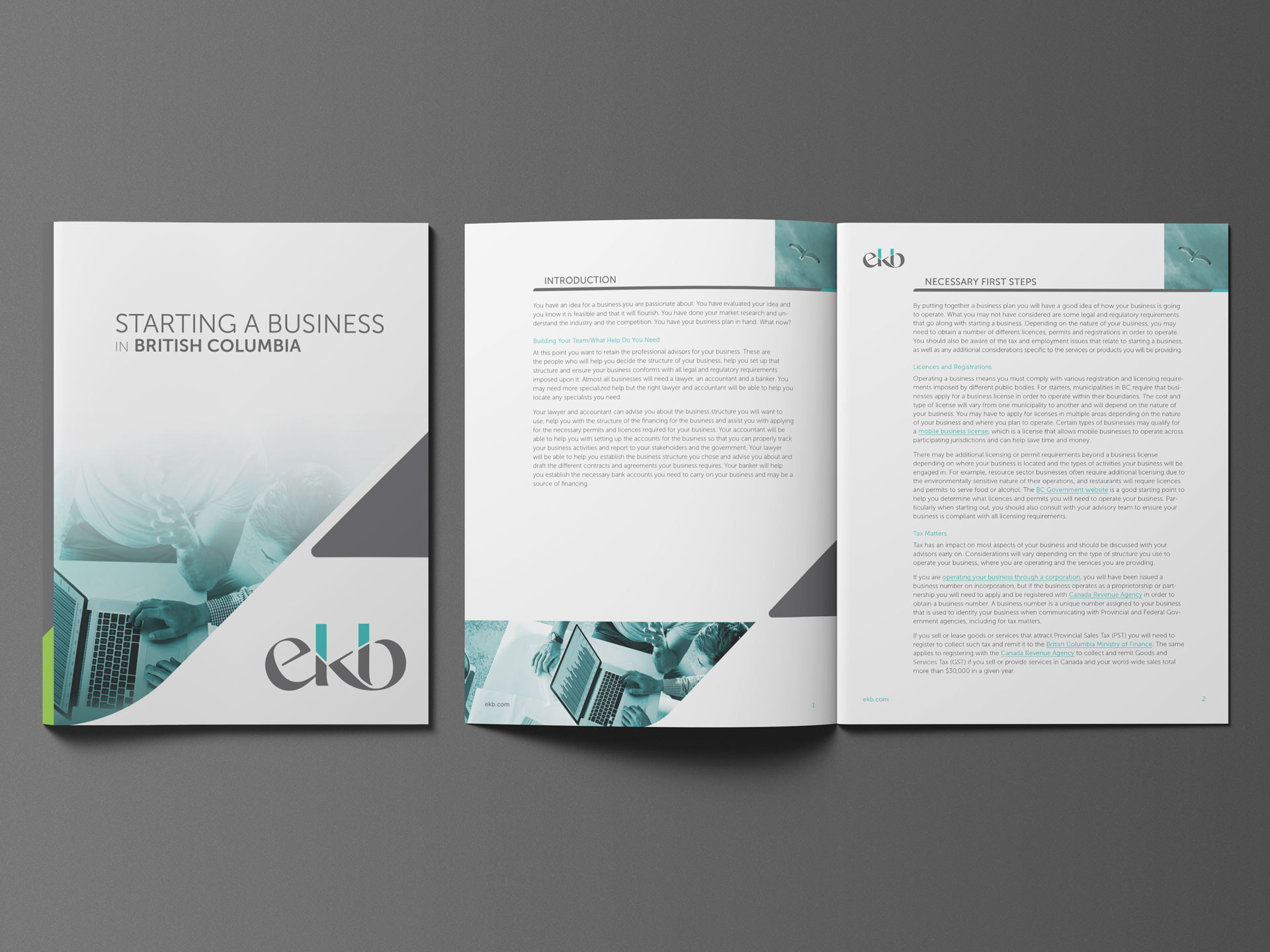
EKB (Edwards, Kenny & Bray LLP) asked fSquared Marketing to help them update their brand. Alongside the services fSquared provided, I was responsible for creating a new visual identity to represent their new brand.
I designed EKB’s new logo to convey a sense of trust: “we’re here for you.” and "on your side for generations". The lowercase letters make the logo feel approachable, while the palette and dynamic lines conjure up a sense of verdant rainforest and the architecture of Vancouver, without coming across as west coast cliché.
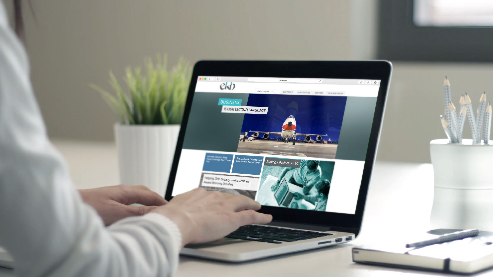
Besides the logo, I also designed the rest of EKB's visual identity, brand style guide, business cards, stationary, Print-to-PDF lawyer biography pages, social media graphics, digital + print advertising and brochure templates. While I did not design the website, I designed aspects of it, such as the "our expertise" mega-menu, the FinTech Blog page, as well as an updated layout for the homepage.
EKB's branding won platinum in the 2016 Marcom awards.

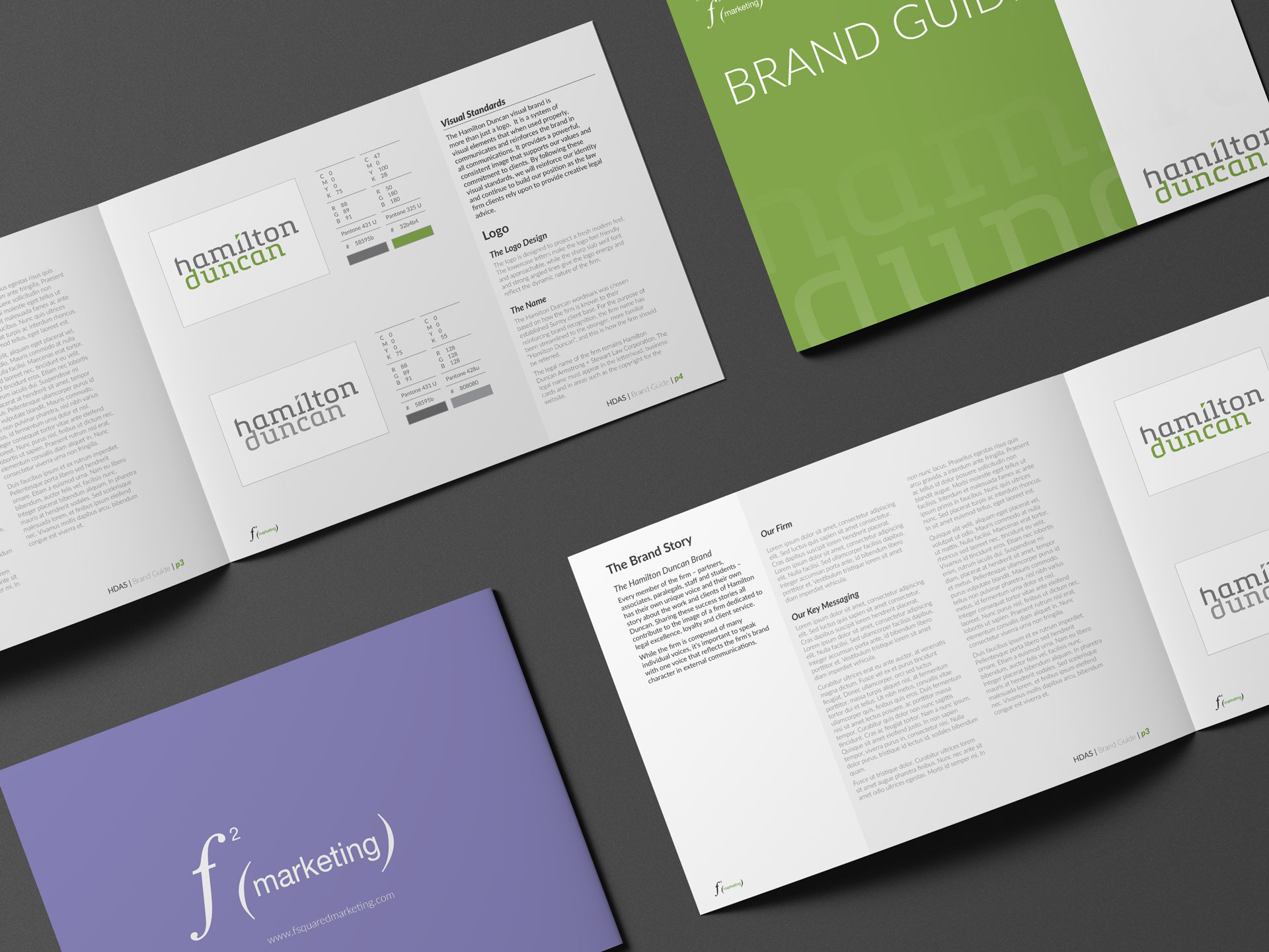
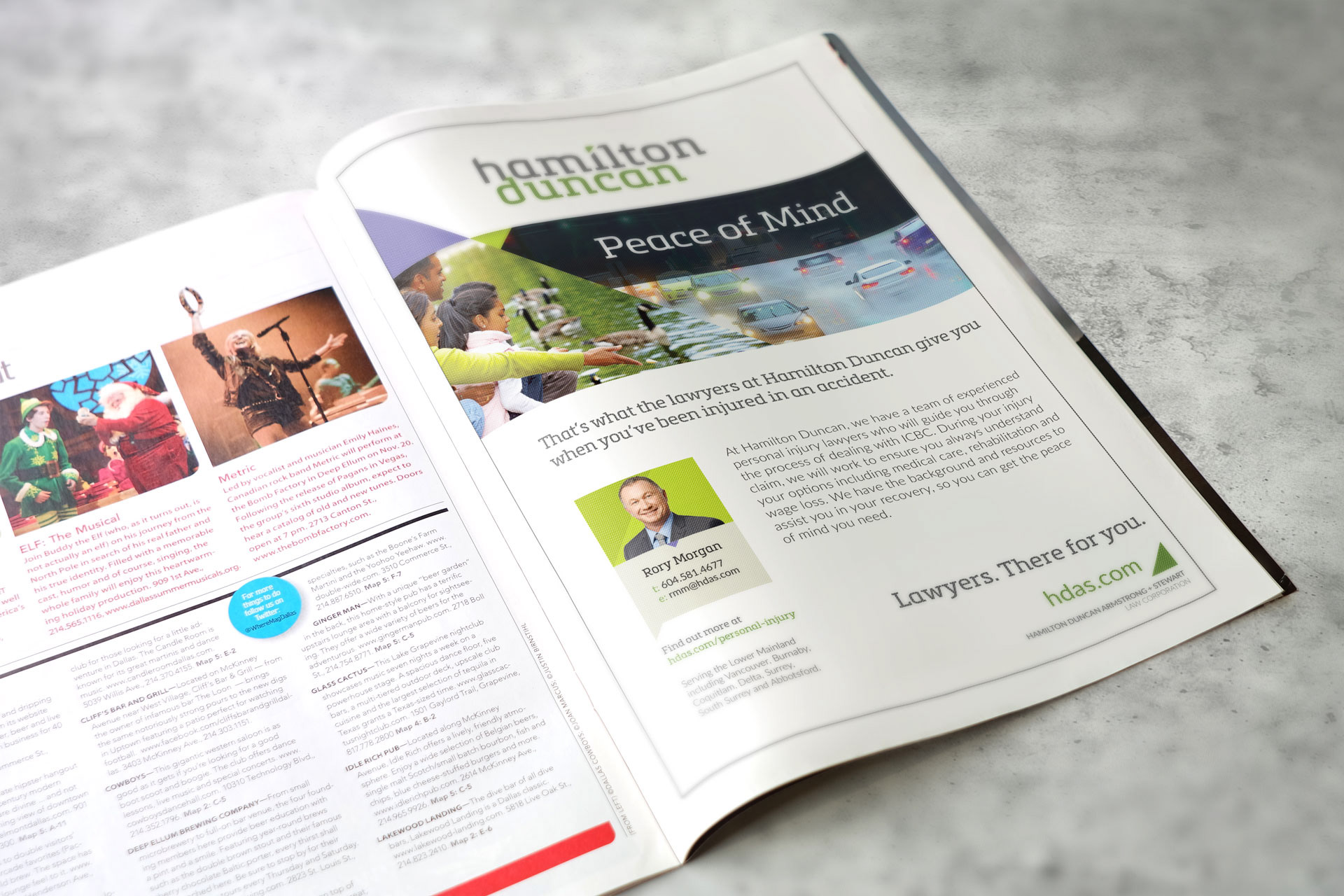
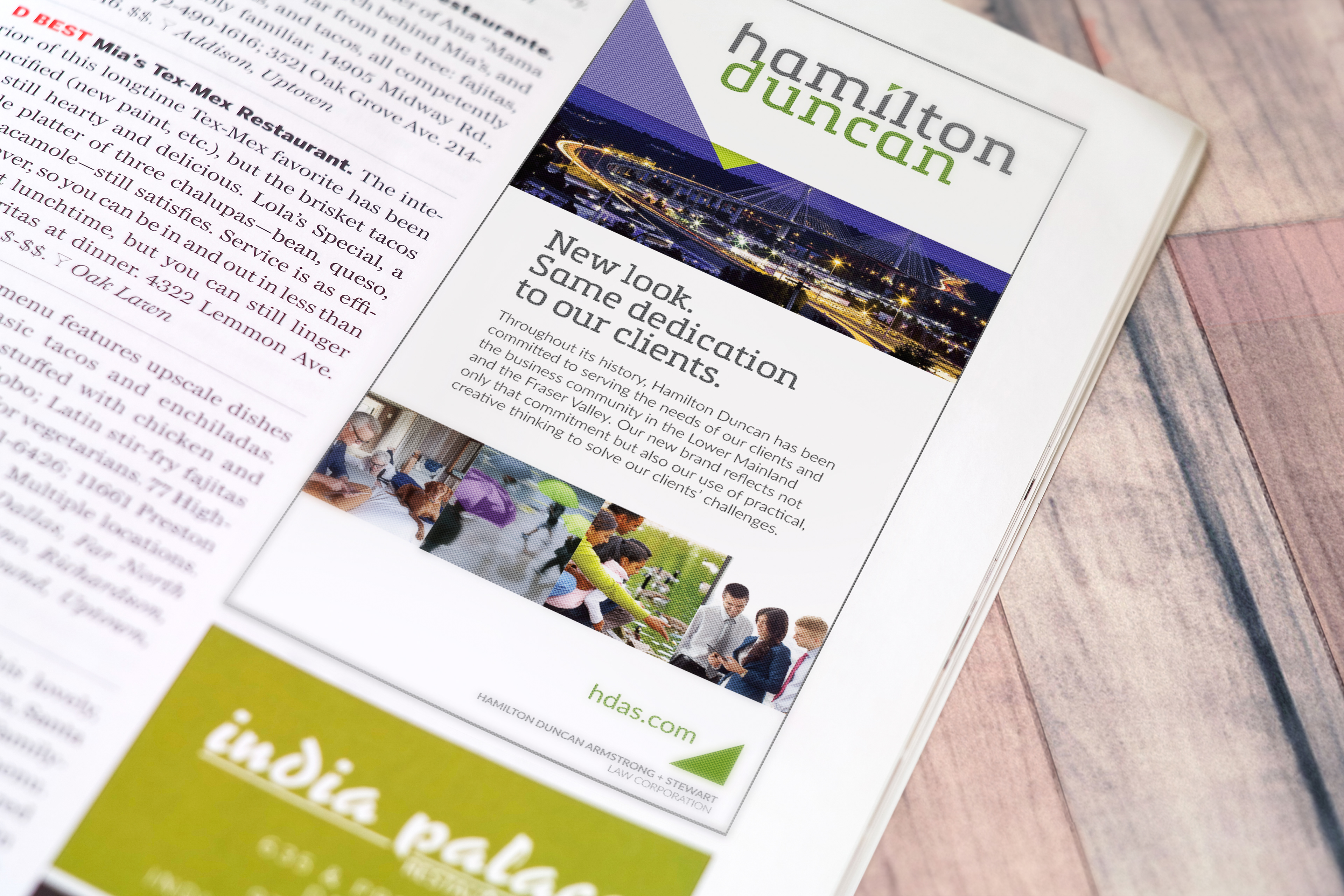
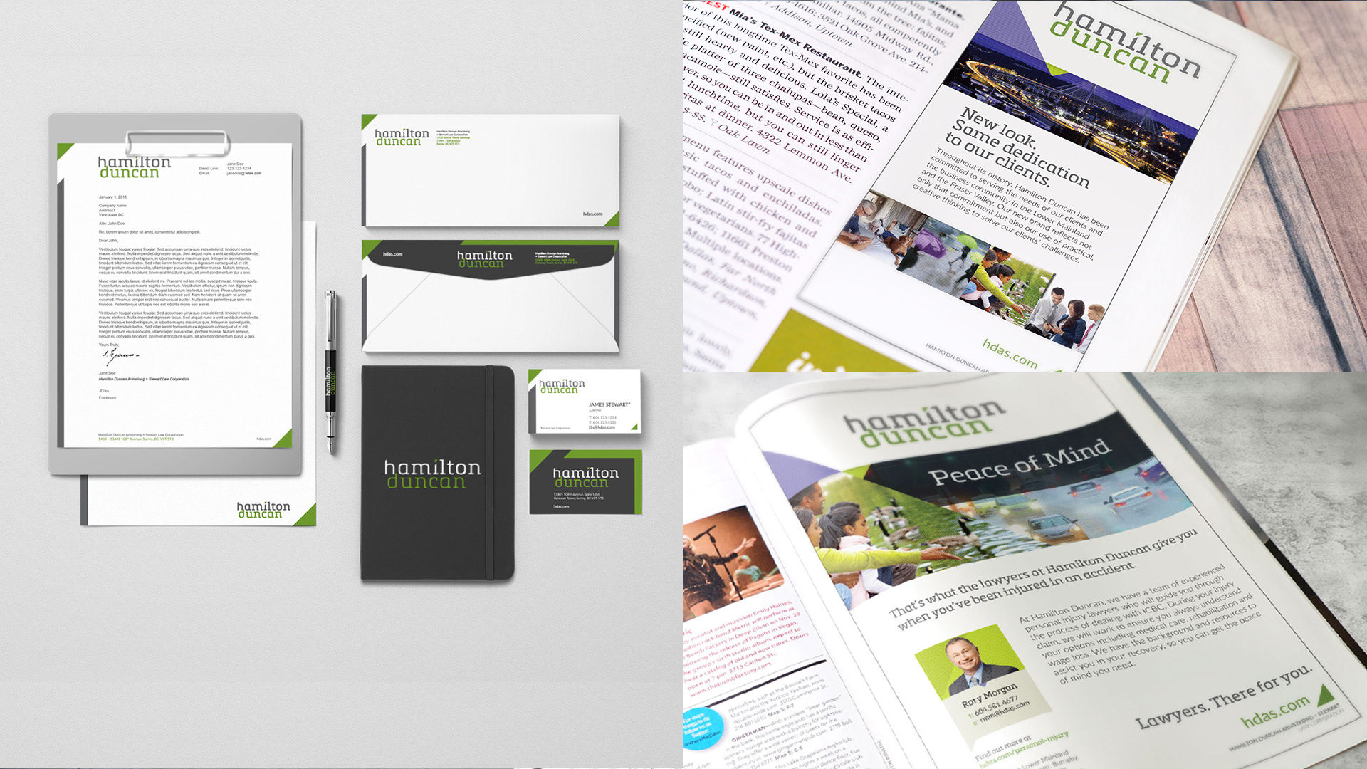
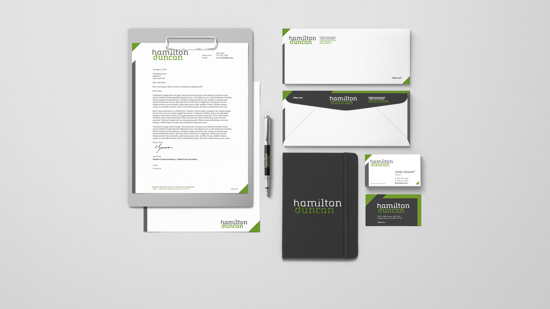
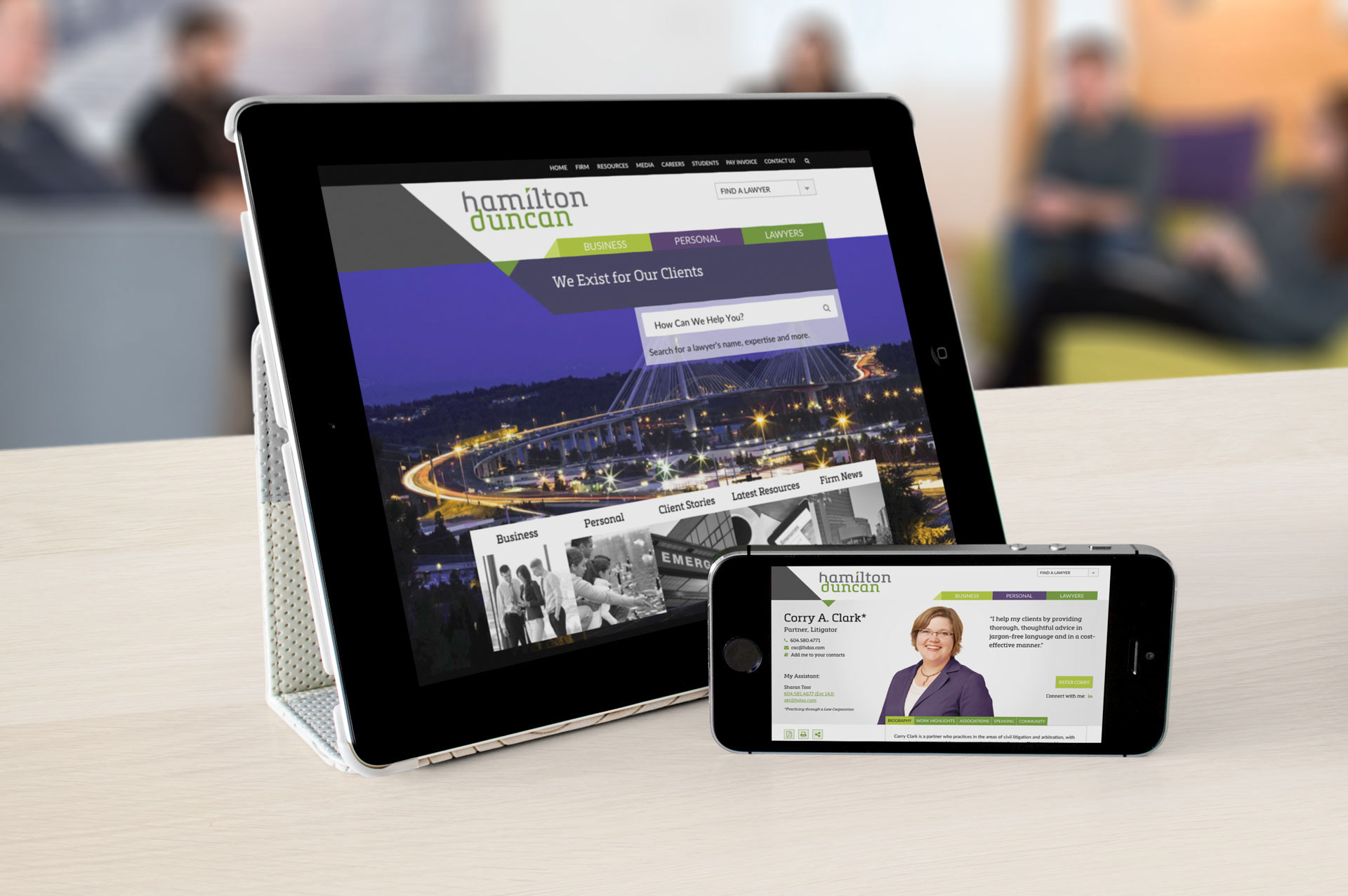
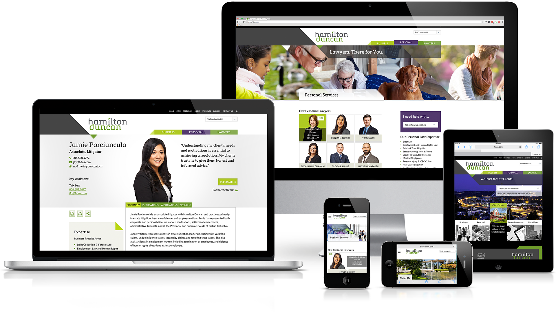
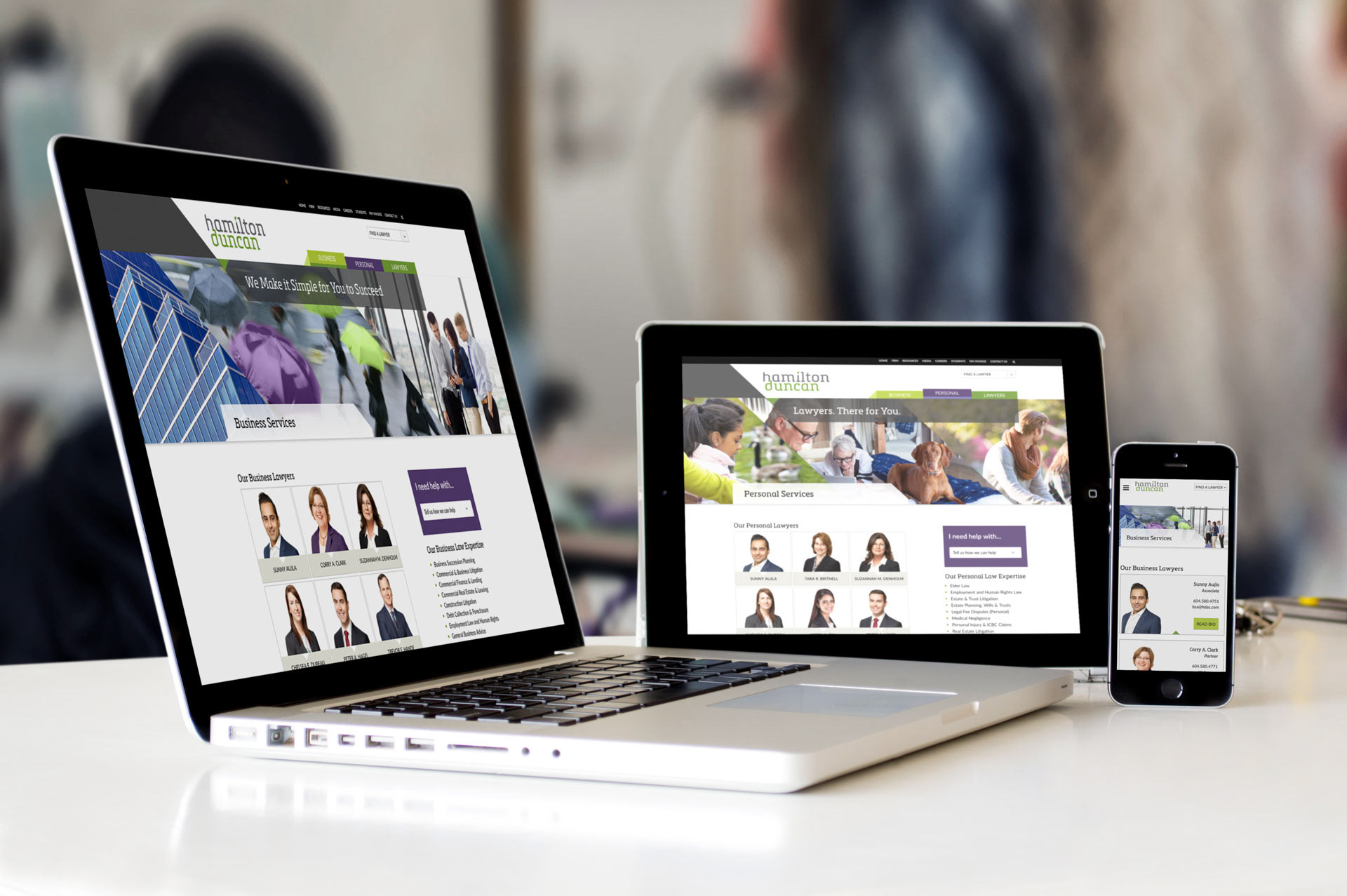
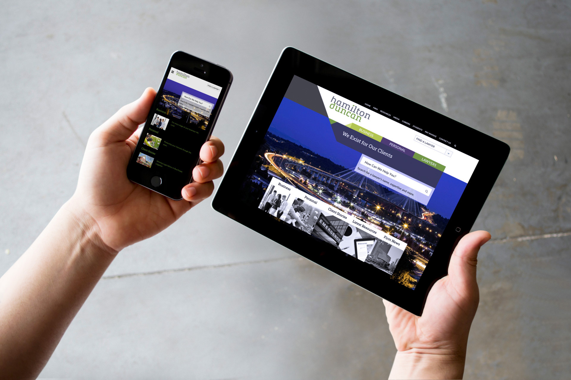
Hamilton Duncan
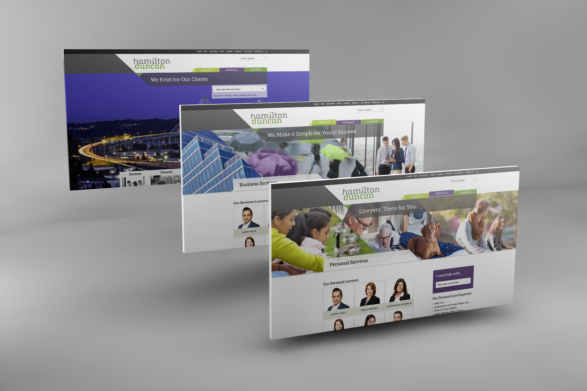
Much like EKB, Hamilton Duncan was looking for an updated brand that better reflected who they are and that appealed to their target market. I was responsible for translating this updated key messaging into a visual identity that could provide continuity across many contexts, digital and print. I created Hamilton Duncan's new logo, brand style guide (fonts, colours, photography styles, do's and don't of logo usage) and assisted in the website design. I designed their stationary package (business cards, e-sig and letterhead) as well as print advertisements.
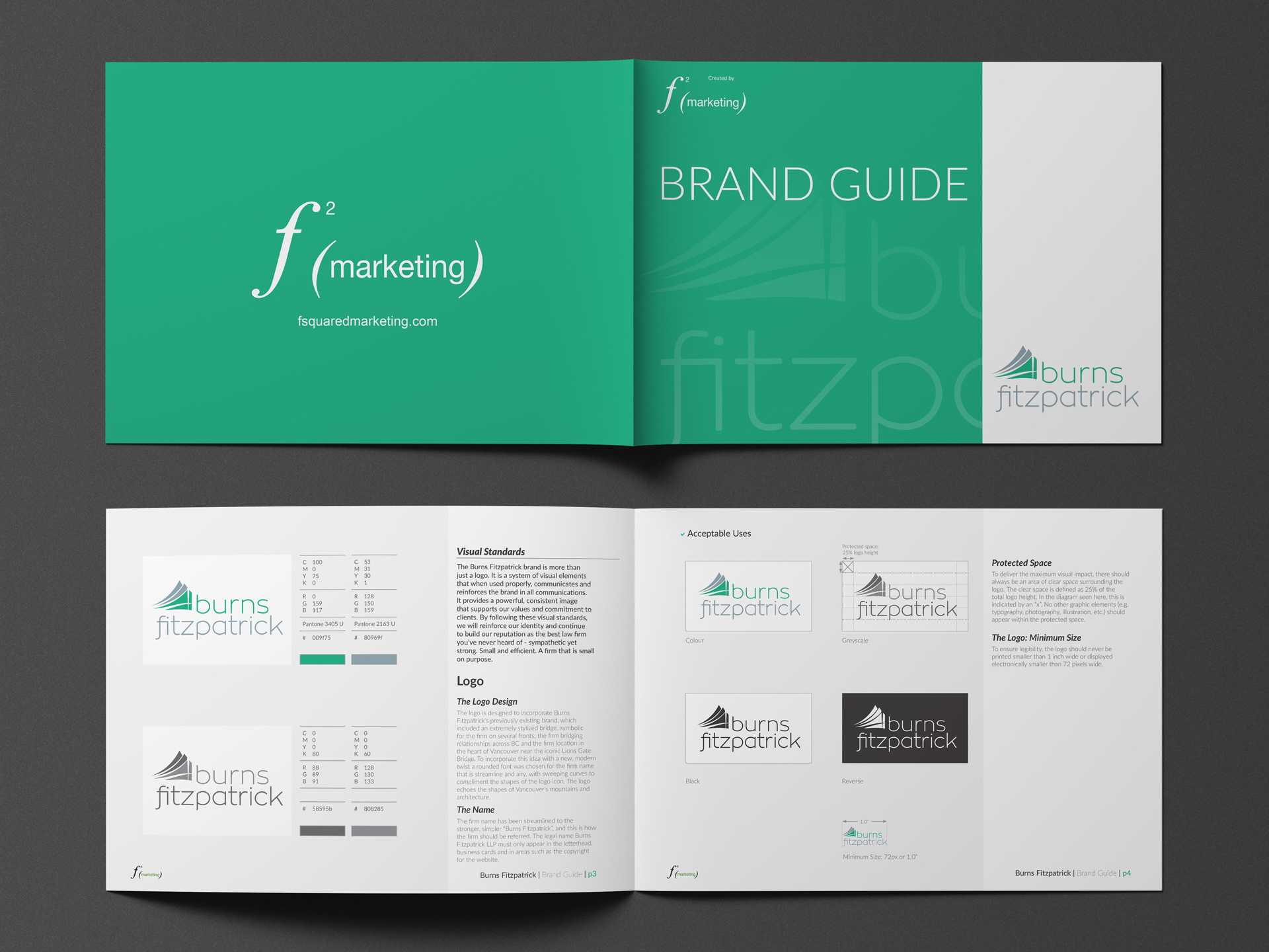
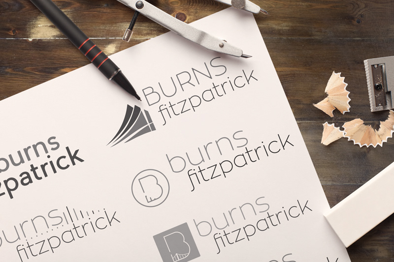
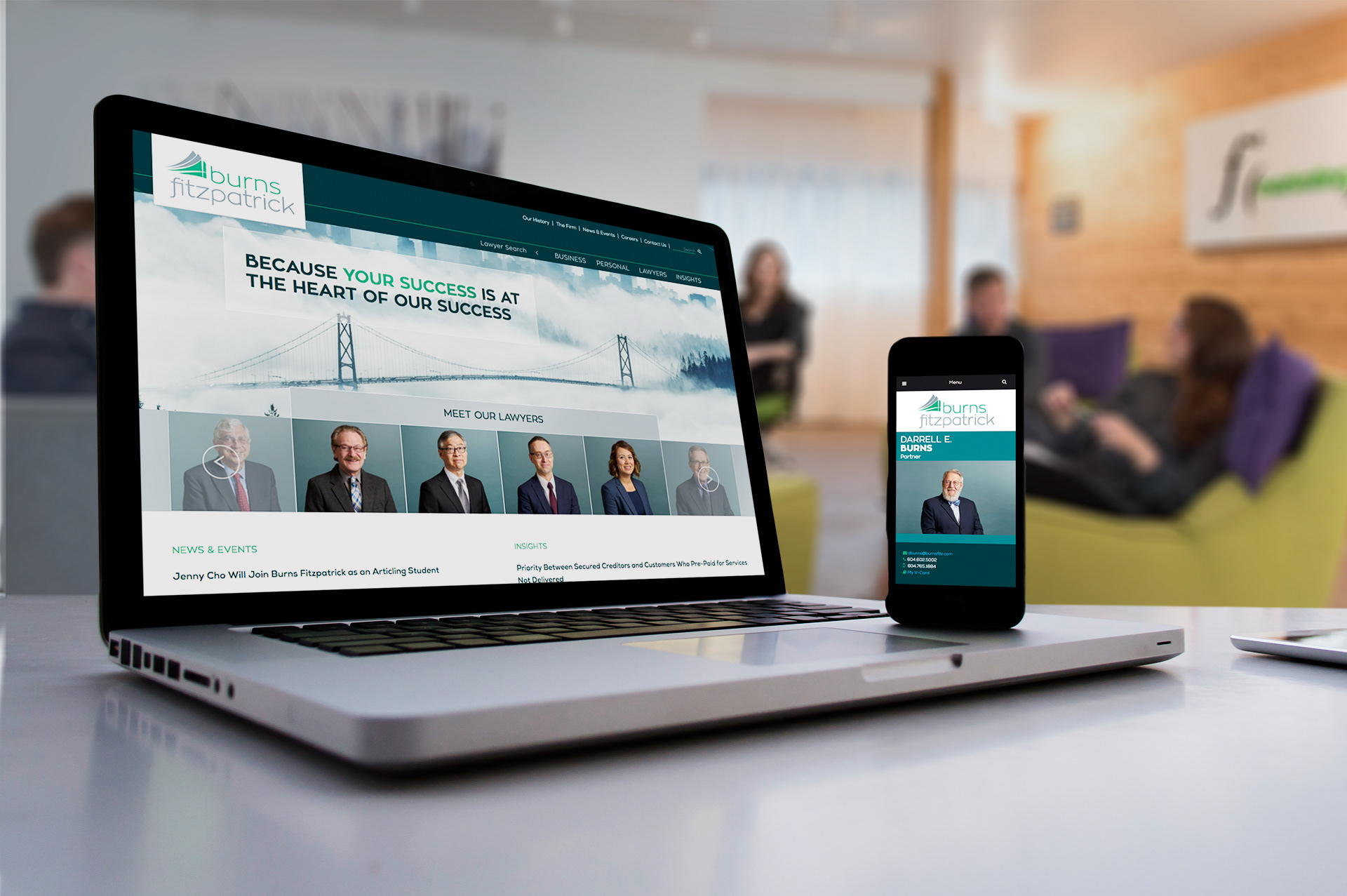
Burns Fitzpatrick
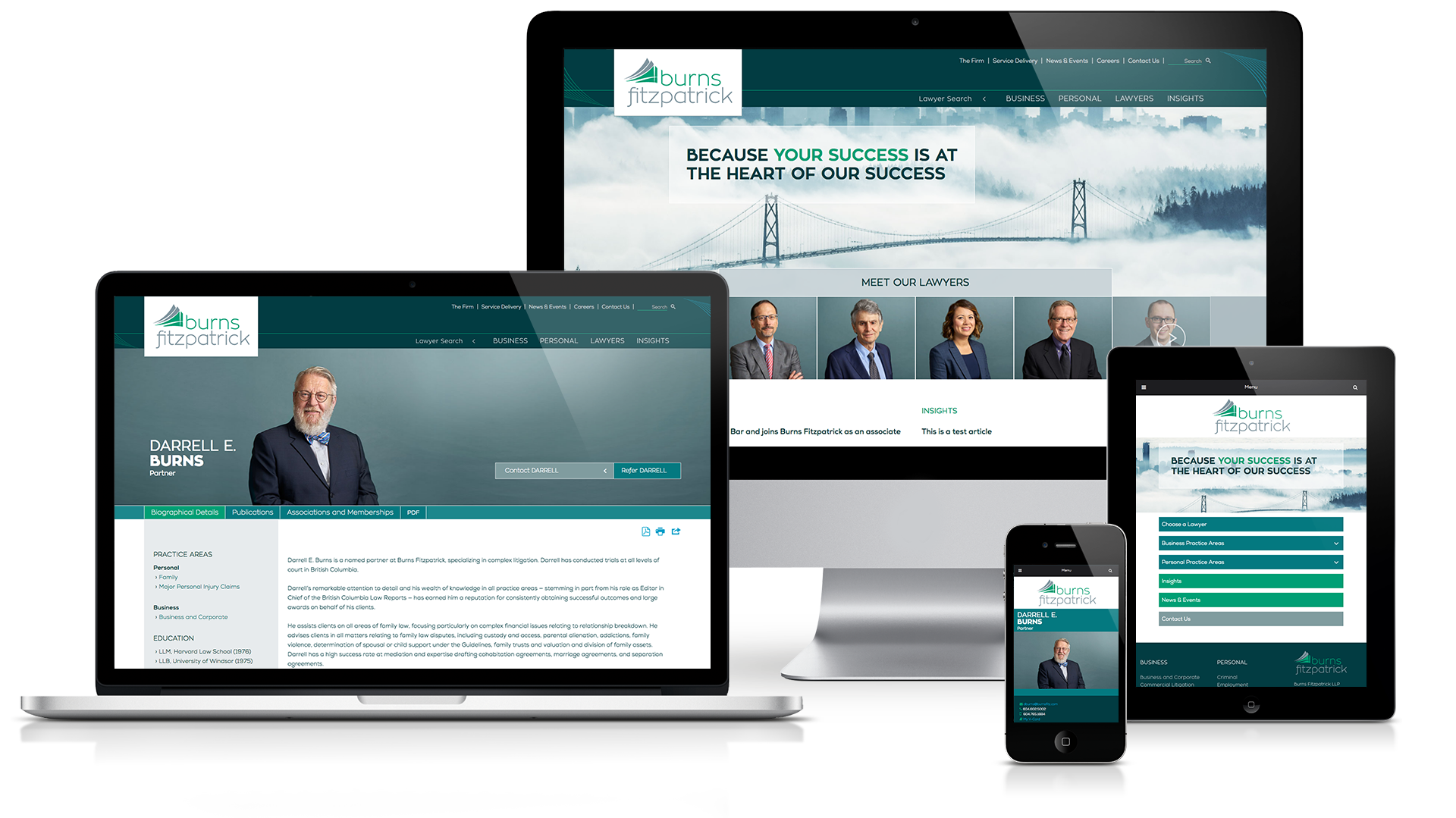
This was a relatively small rebrand project; a small law firm with very little existing marketing materials. I was tasked with creating their complete visual identity.
The new logo was to incorporate a bridge as a nod to both their original logo and their location in the heart of downtown Vancouver, as well as the colour green. Using sweeping shapes I was able to symbolize the iconic Lions Gate Bridge along with the North Shore mountains, complemented by a friendly lowercase font. I also produced a brand style guide (fonts, colours, photography styles, do's and don't of logo usage etc), stationary package (business cards, digital letterhead), as well as the website design.
Burns Fitzpatrick's Branding won an honourable mention in the 2016 Marcom Awards, as well as honourable mention in the 2017 Hermes Awards.


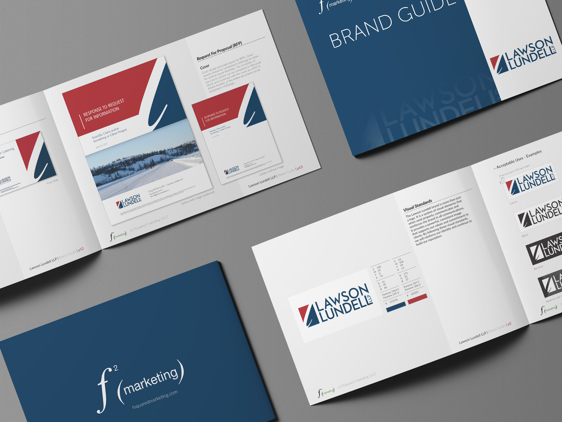
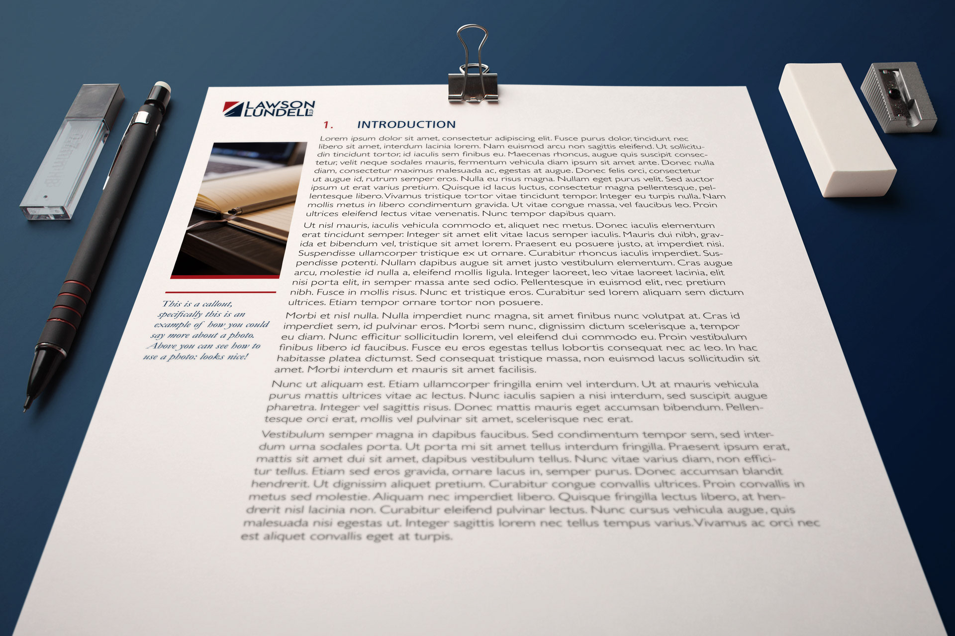
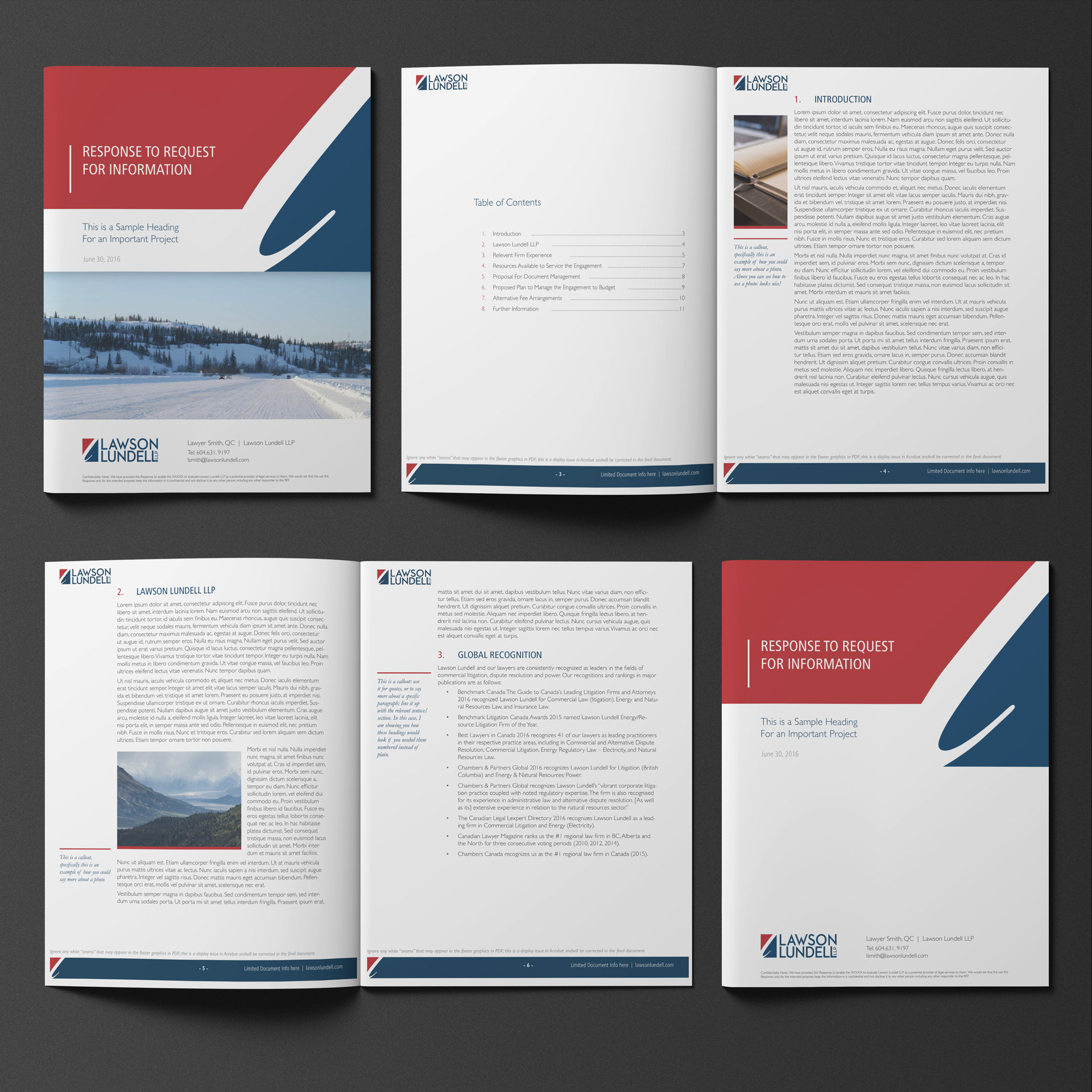
Lawson Lundell
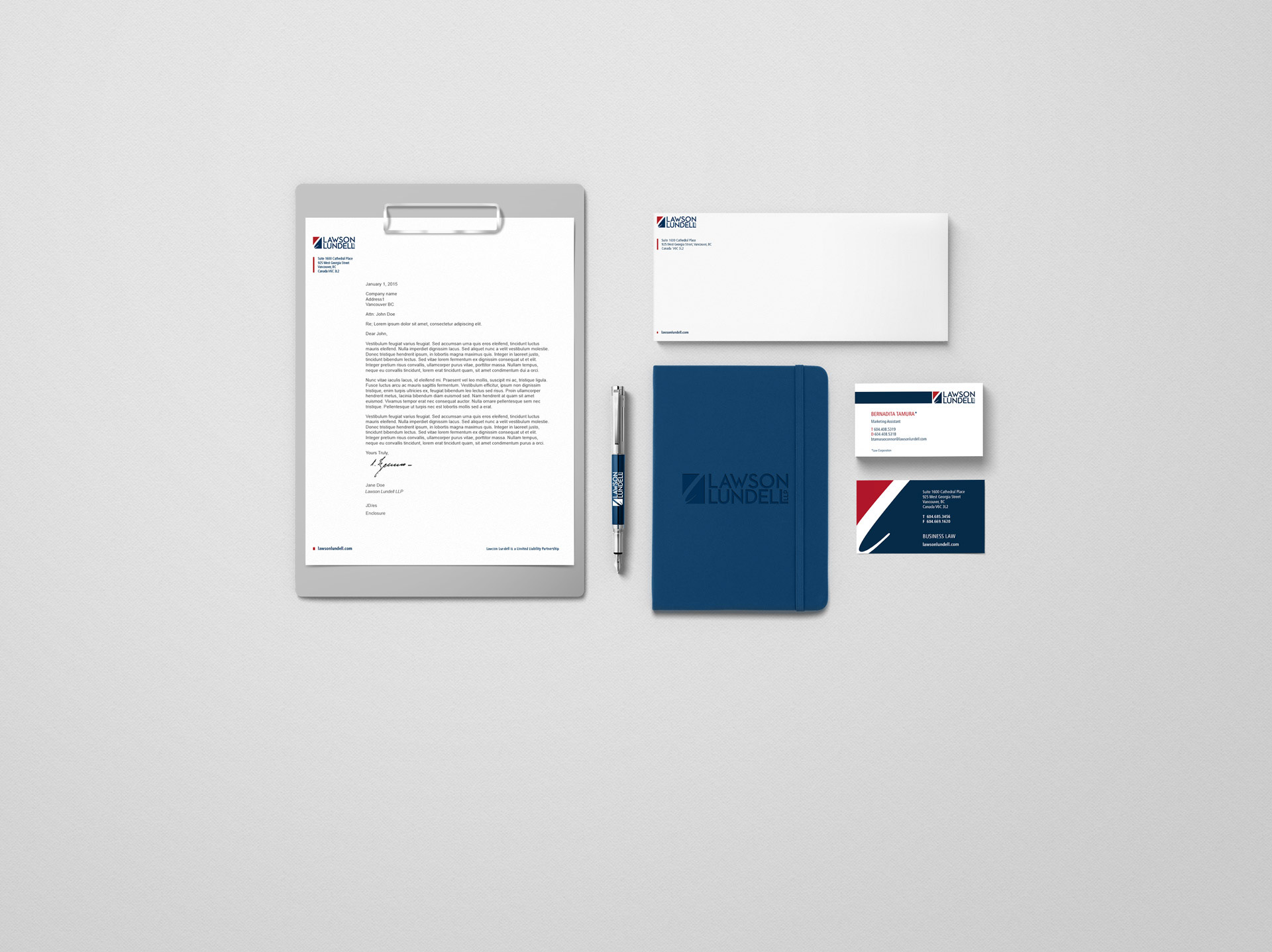
Lawson Lundell had an established, albeit outdated brand with inconsistent marketing materials. They just needed fSqaured Marketing to provide a style guide accompanied by cohesive, updated marketing materials. I brightened the red in their logo as requested, then updated their business card, envelope, letterhead and powerpoint designs. I also created a new RFP template for them to use going forward.
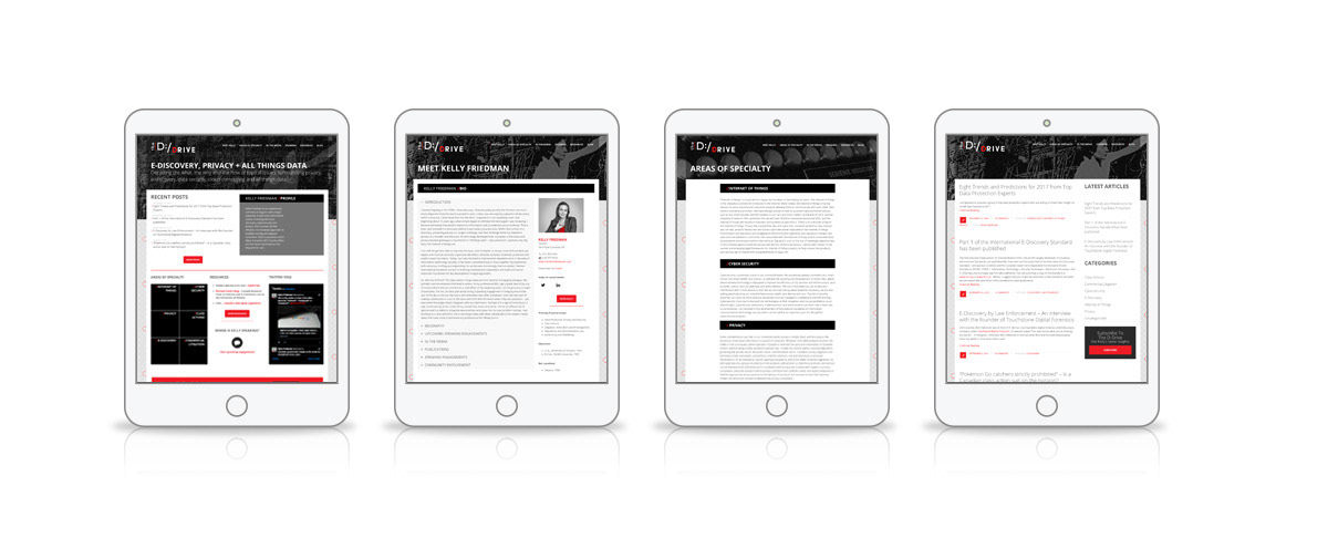
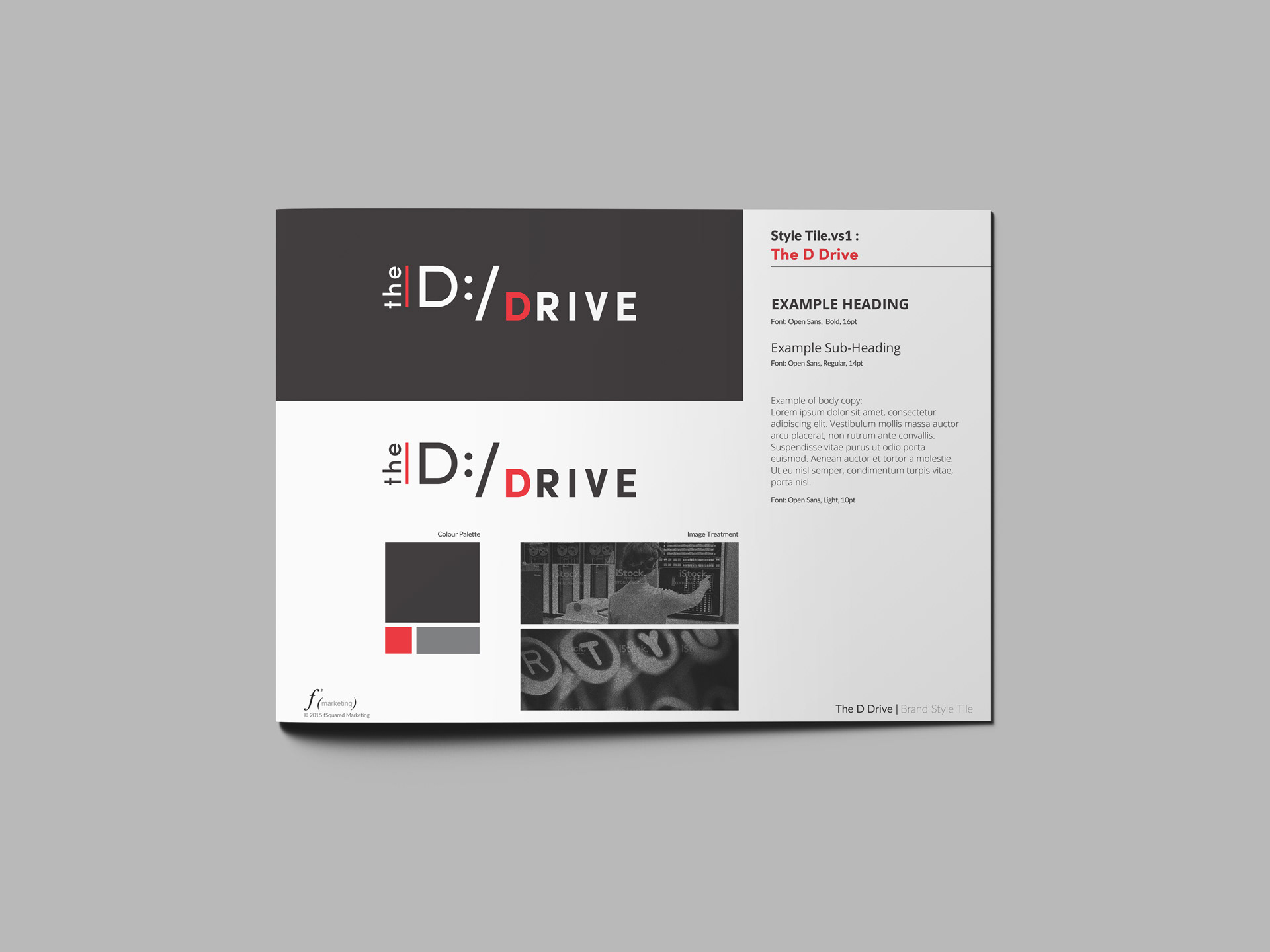
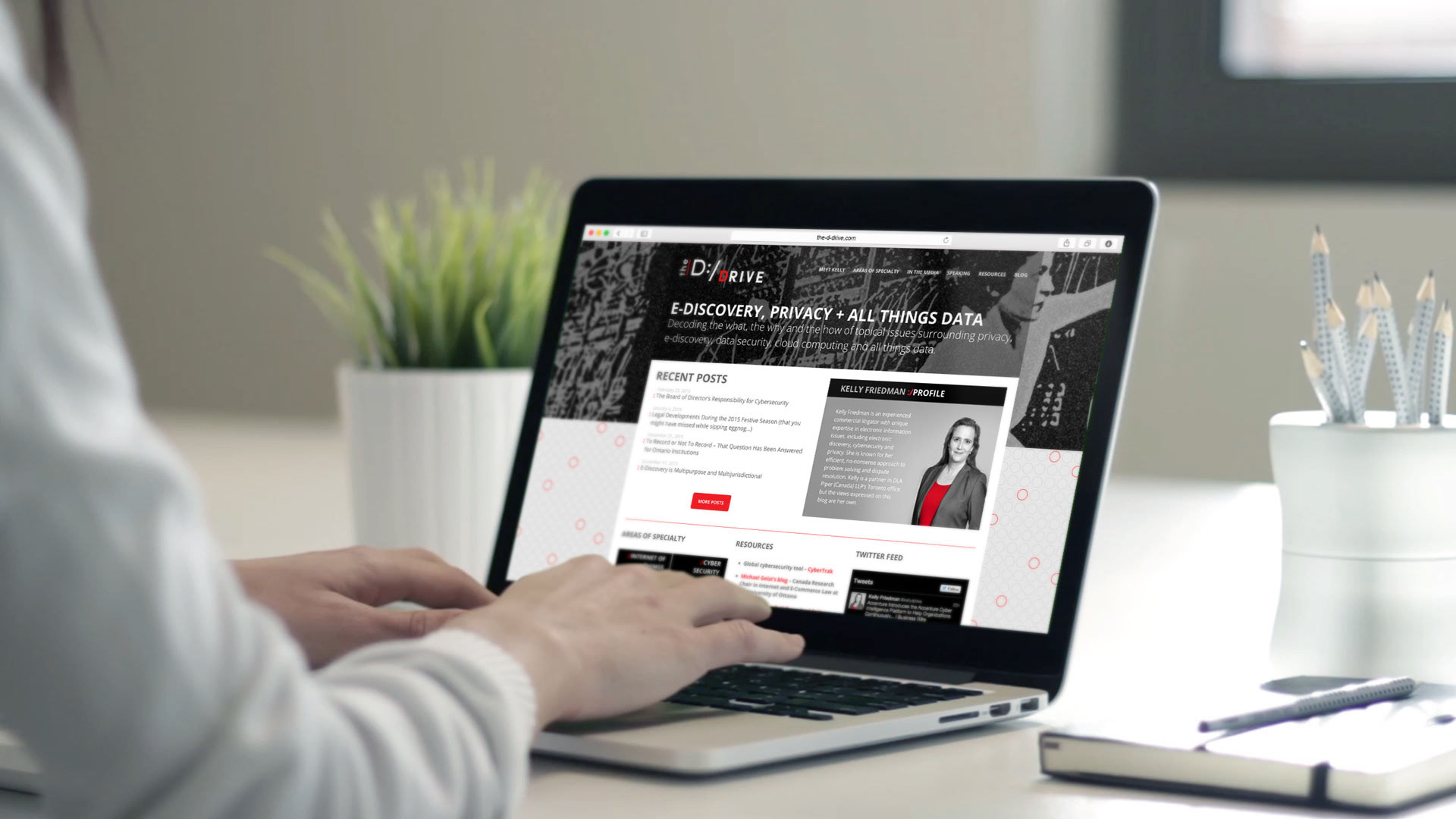
The D:/Drive
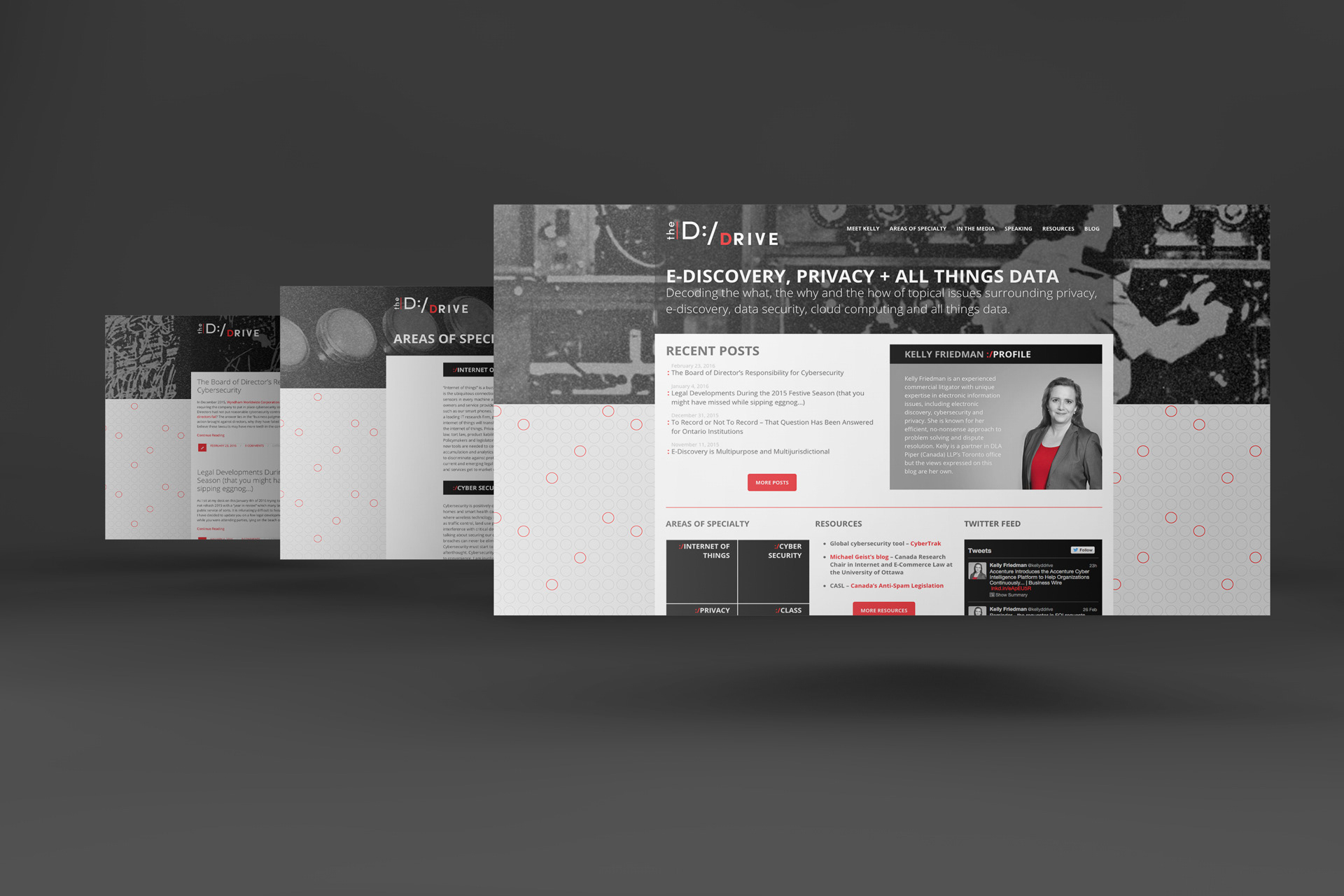
I was tasked with creating the look and feel for a lawyer blog about privacy, data and the law. I created the logo, style tile and basic look and feel for the blog. We decided to go for a vintage style for the imagery, using black and white photography of early female computing specialists plus an added noise effect to create a consistent photography treatment across all pages.