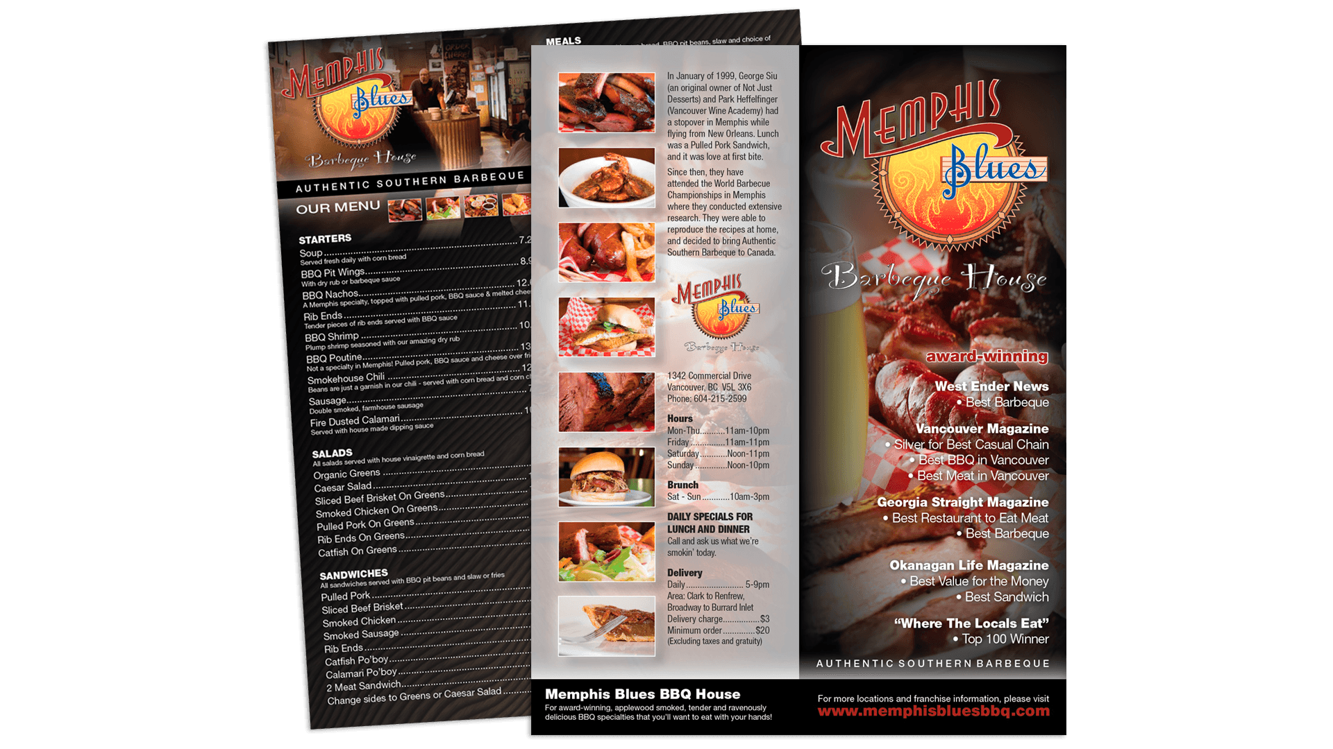
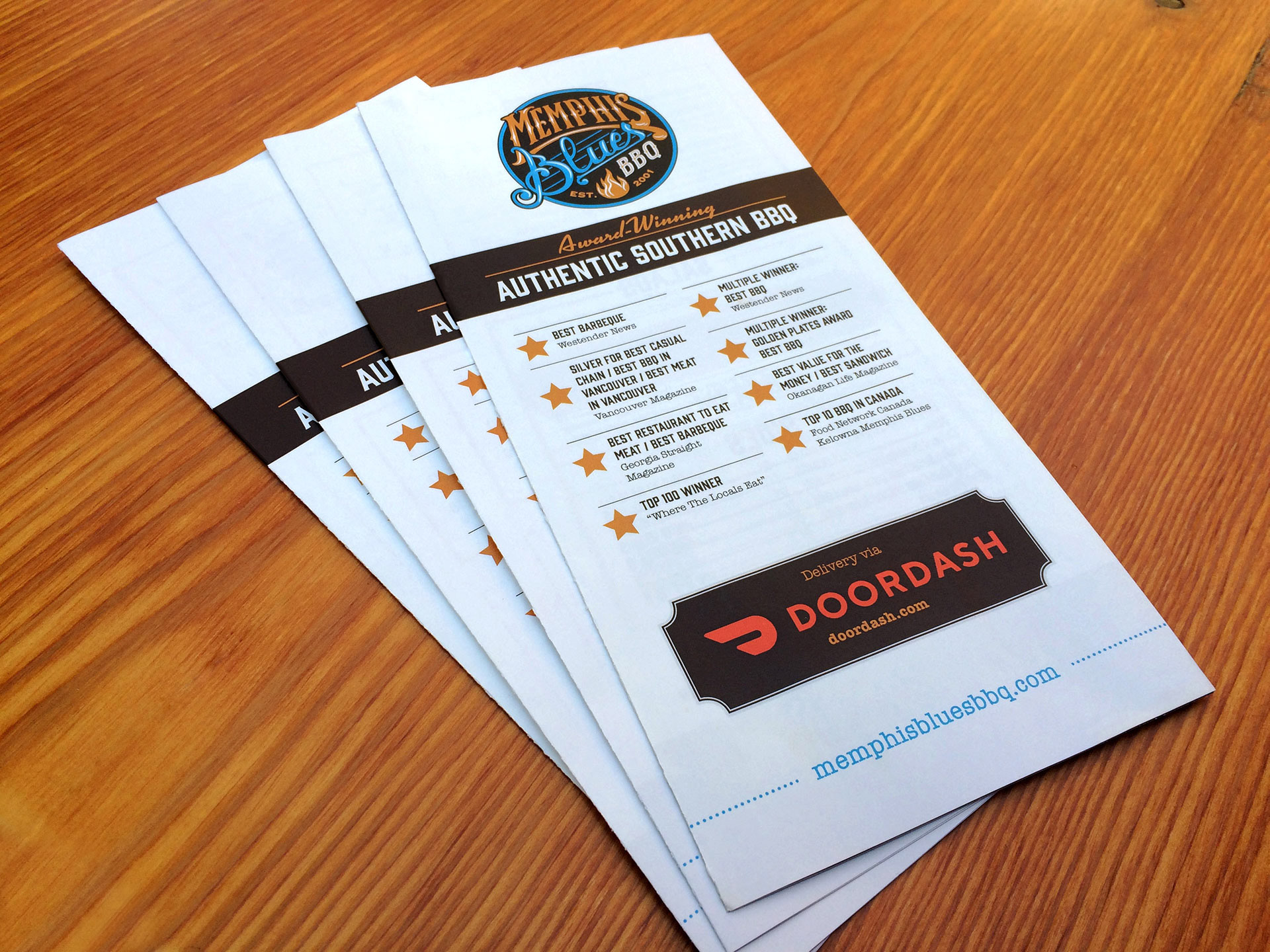
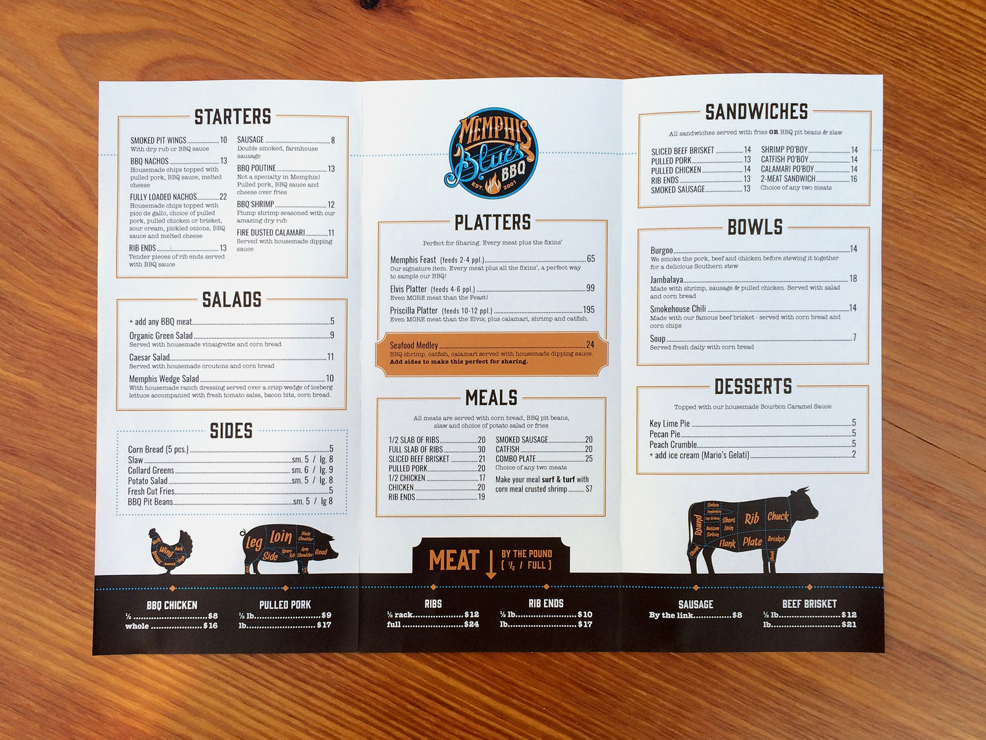
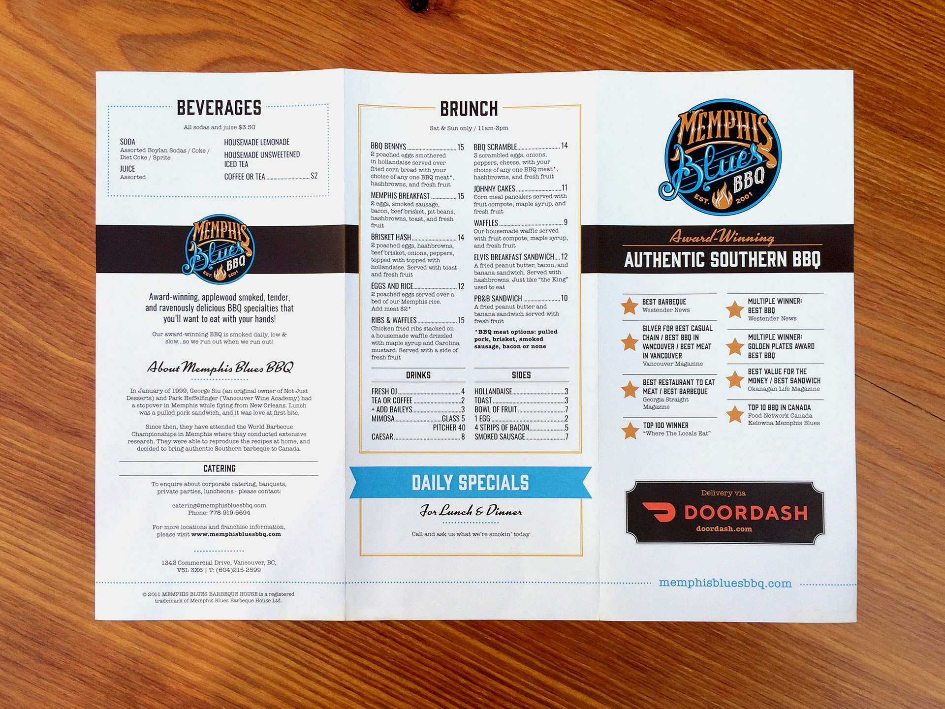
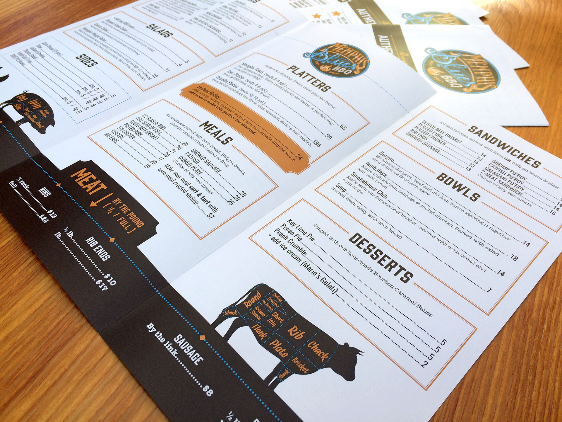
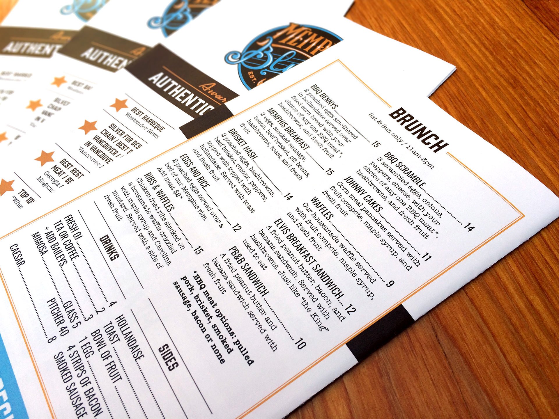
I was asked my Memphis Blues BBQ to update their logo and create brand guidelines for them to adhere to going forward. Since this restaurant business is a franchise, I was also asked to create an updated menu that was flexible enough to swap in menu variations for their different locations. Also, the design had to work in a trifold format for their take-out menu, as well as in a flat, laminated page for repeated use in the restaurant.
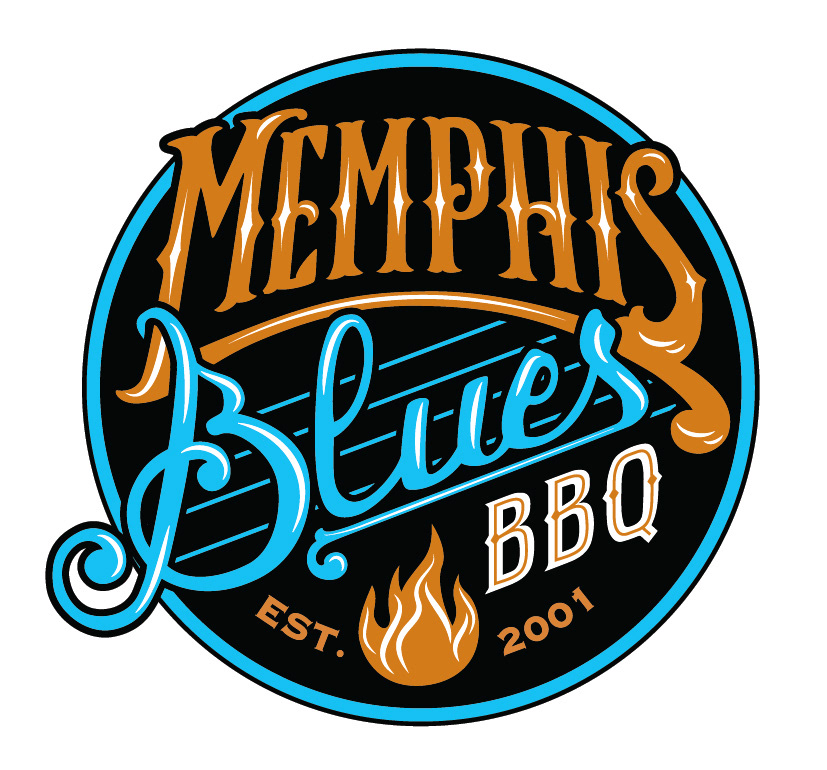
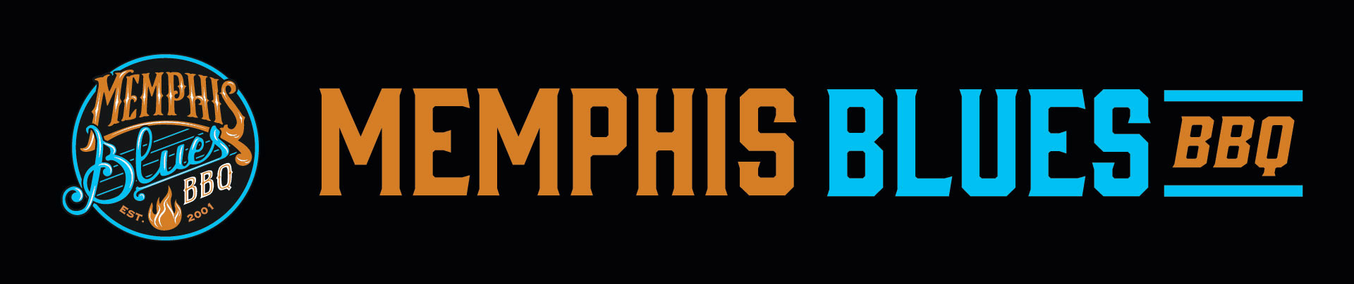
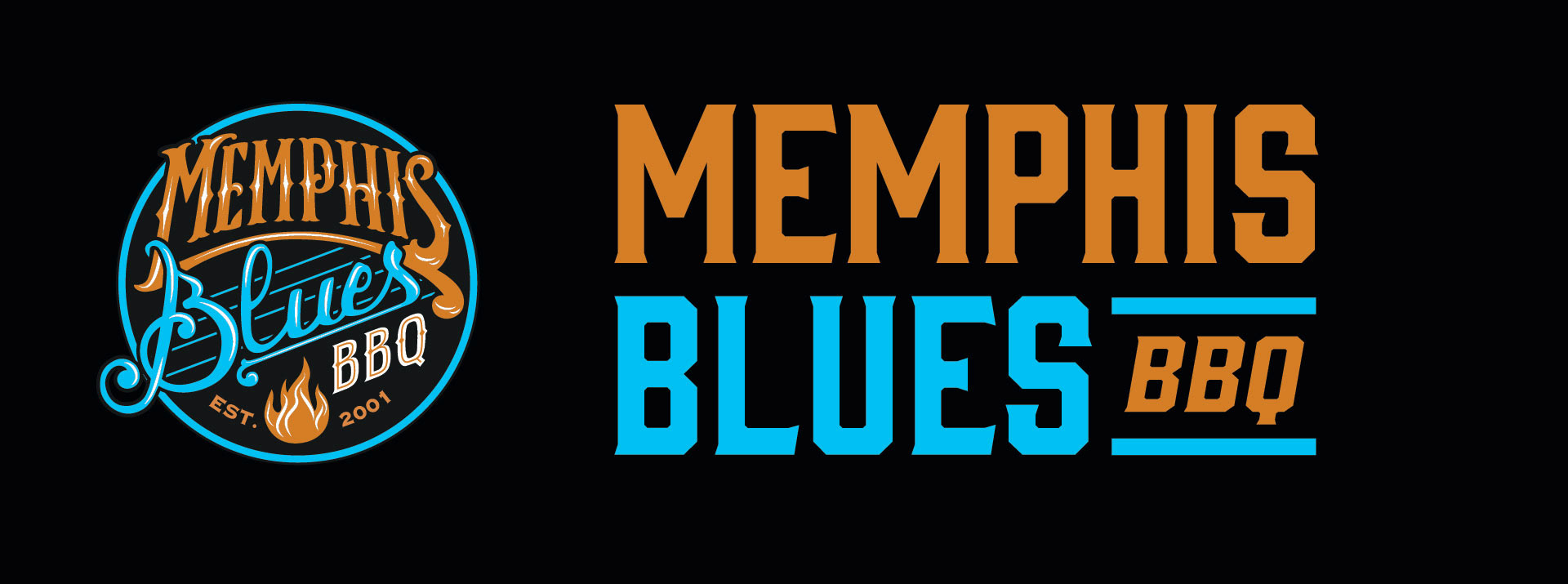
The goal of the logo redesign was to make the new logo more modern and flexible, while keeping a bit of continuity between new and old. This was accomplished through custom lettering in a Southern, hand-drawn style plus fresh tweaks to the blues and oranges. Keeping the circle motif, music score and "treble clef B" tied in all the client's favourite parts of their old logo, imparting the blues-y vibe they wanted to get across. Adding a wordmark option in two orientations ensures that they will be able to have an impactful, legible logo on everything from signage to ballpoint pens.
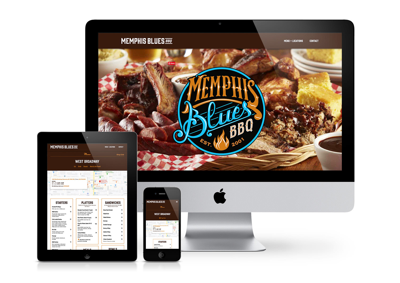
Memphis Blues needed a new website to match their new look, so working as a team with the Memphis Blues staff and Denise Lawson of WindShift Web Design, I designed then Denise developed a website that was user-friendly, on-brand, mobile responsive and enabled them to use their current photography. We streamlined the process for users to reach the various franchise pages, each with unique menus and features, as well as allowing the MB staff to make minor changes to menu pricing as required over time. We struck balance between custom features, style and use-ability for the Memphis Blues team that I believe will serve them and their customers for years to come!
The old menu and original logo.